
The Challenge
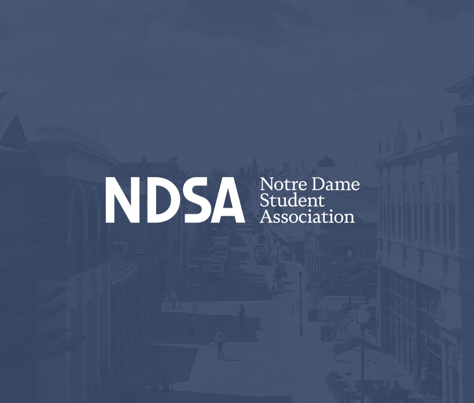
The Notre Dame Student Association (NDSA) has represented student interests at the University of Notre Dame Australia's Fremantle campus since 1996. As the association approached its 30th anniversary, NDSA needed a brand refresh that could honour three decades of student representation.
The Logo
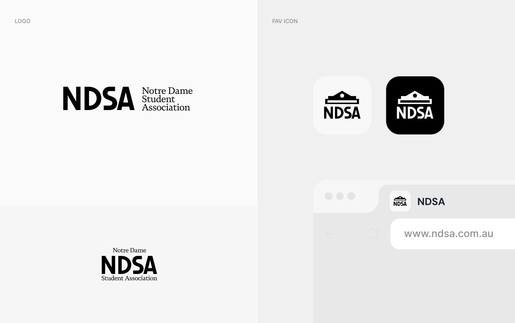
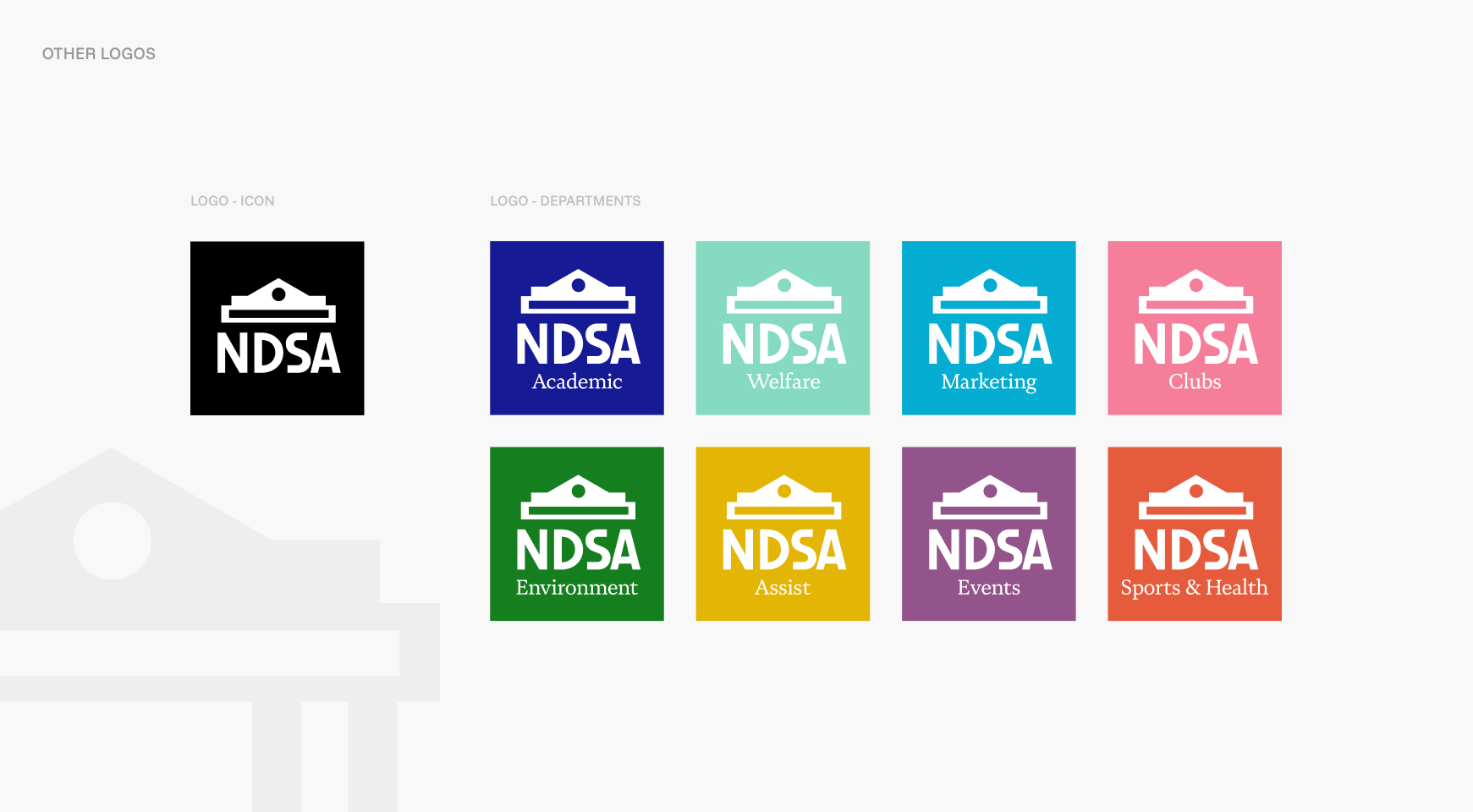
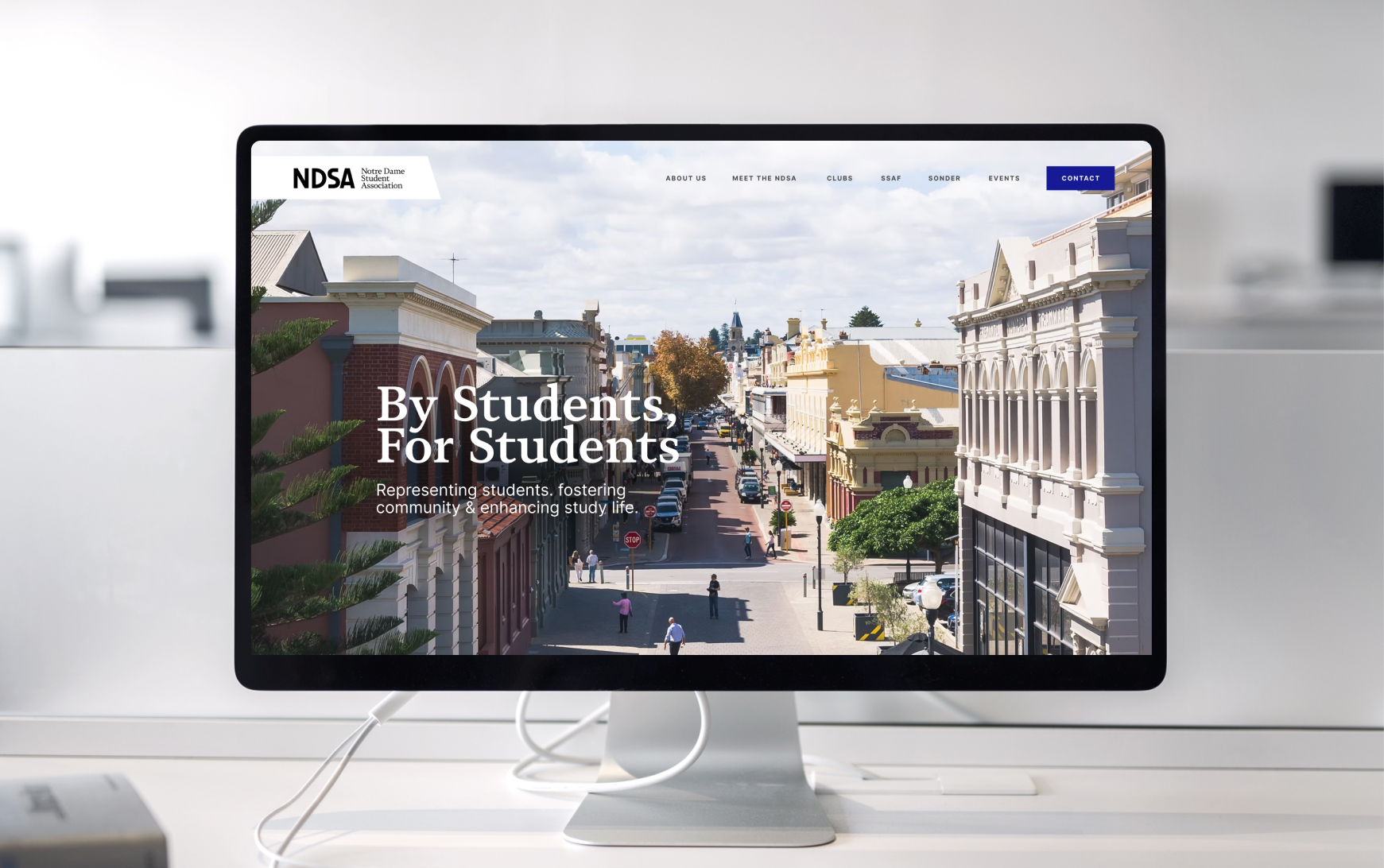
OKMG delivered a dual-focused branding project, beginning with a refined logo set in custom fonts that are crisp and clean with a black-on-white balance, versatile across digital and print applications. The geometric precision of the Bauhaus-inspired typeface and logo design communicates professionalism and modernity.
The Anniversary Identity
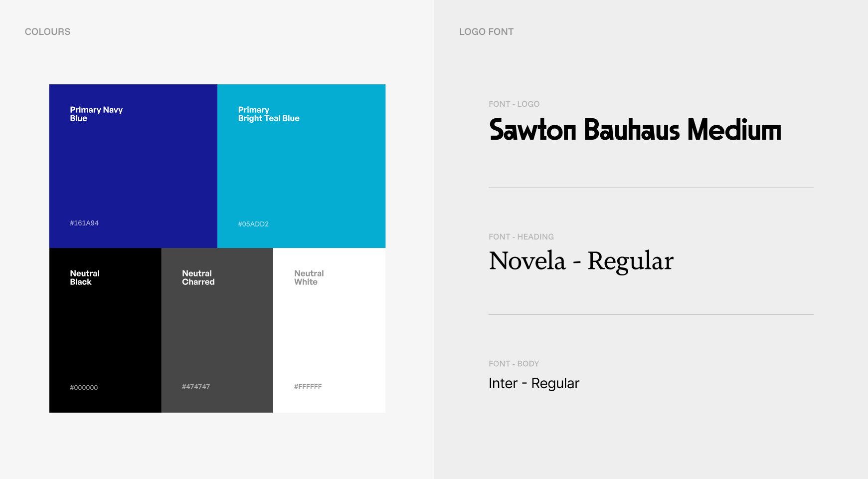
For the 30-year anniversary celebration, OKMG developed a distinctive commemorative graphic based on the shape of the local building on campus that is distinctly recognisable to the student body. We then paired this with a fun and fresh palette of navy blue, bright teal blue, black and grey against white. The navy blue anchors the design in institutional credibility, the bright teal injects energy and contemporary appeal that resonates with current students, and the neutral greys provide balance.
The Result
Together, the logo redesign and anniversary identity support NDSA's mission of representing students, fostering community and enhancing campus life, providing the association with branding that reflects both its established position and its ongoing commitment to serving Notre Dame students at the Walyalup Fremantle campus.

.svg)
.svg)
Let's
Let’s discuss how we can bring reinvigorated value and purpose to your brand.
.svg)