
.svg)
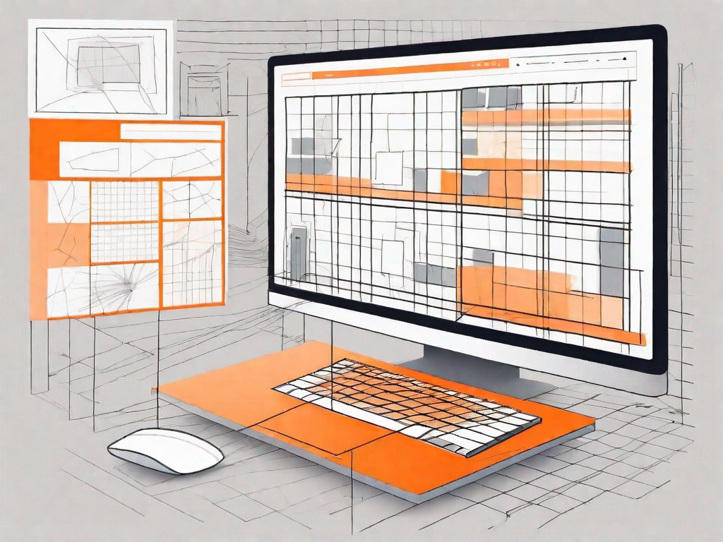
How to use Webflow's grid layout system
.svg)
Webflow's grid layout system is a powerful tool that allows you to create complex and visually appealing website layouts. Whether you are a beginner or an experienced web designer, understanding how to use this system effectively is crucial for creating engaging and seamless user experiences.
Understanding the Basics of Webflow's Grid Layout System
Before diving into the specifics of using Webflow's grid layout system, it is essential to grasp the core concepts behind it. In simple terms, a grid layout is a way of organizing and aligning elements on a web page. It provides a structured framework that allows for consistent spacing, positioning, and responsiveness.
Grid layouts are particularly important in web design because they enhance visual hierarchy, readability, and overall user experience. By using grids, you can easily align elements, create harmonious proportions, and ensure that your website looks polished and professional.
When it comes to web design, attention to detail is key. Grid layouts offer a level of precision and control that can elevate your design from good to great. By aligning elements to a grid, you create a sense of order and balance that is pleasing to the eye. This attention to detail can make a significant difference in how users perceive and interact with your website.
What is Webflow's Grid Layout System?
Webflow's grid layout system is a feature-rich tool that provides effortless flexibility and control over your web designs. It allows you to create grids using a combination of rows and columns, which can adapt to different screen sizes and devices.
With Webflow's grid layout system, you have the power to create complex and dynamic layouts without the need for extensive coding knowledge. The intuitive interface makes it easy to define the number of columns, adjust their widths, and set up responsive breakpoints.
One of the standout features of Webflow's grid layout system is its ability to create nested grids. This means you can have grids within grids, allowing for even more precise control over your design. Whether you're creating a simple blog layout or a complex e-commerce website, Webflow's grid layout system has you covered.
The Importance of Grid Layouts in Web Design
Grid layouts play a vital role in web design as they provide structure and consistency to your website. They allow you to create easily scannable content with clear visual hierarchies, making it simpler for users to navigate and find the information they need.
Imagine visiting a website where the content is scattered randomly across the page, with no clear organization or alignment. It would be a frustrating and confusing experience, right? Grid layouts solve this problem by providing a framework that guides the user's eye and helps them make sense of the content.
By using grid layouts, you ensure that your website adapts seamlessly to various devices and screen sizes. This responsiveness is essential in today's mobile-first world, where users expect a consistent and user-friendly experience regardless of the device they are using.
Additionally, grid layouts make it easier to maintain and update your website. With a well-structured grid in place, you can easily add or remove elements without disrupting the overall design. This flexibility is especially valuable when it comes to scaling your website as your business grows.
In conclusion, understanding and utilizing Webflow's grid layout system is crucial for creating visually appealing and user-friendly websites. By harnessing the power of grids, you can take your web design skills to the next level and deliver exceptional digital experiences.
Setting Up Your Grid Layout in Webflow
Now that you understand the basics of Webflow's grid layout system, let's dive into the process of setting up your own grid layout. Follow these simple steps to get started:
Starting a New Project in Webflow
The first step in using Webflow's grid layout system is to create a new project within the Webflow platform. Once you have set up your account and logged in, navigate to the dashboard and click on the "New Project" button. Give your project a name and set the necessary project settings.
Creating a new project is an exciting moment as it marks the beginning of your web design journey. You have the opportunity to bring your ideas to life and create a visually stunning website. Take your time to think about the purpose and goals of your project, as this will guide your design decisions throughout the process.
Once you have named your project and set the necessary settings, you can choose from a variety of templates or start from scratch. Templates provide a great starting point and can save you time, especially if you are new to web design. However, if you prefer complete creative freedom, starting from scratch allows you to unleash your imagination and create a unique design.
Navigating the Grid Layout Interface
After creating your project, you will be taken to the Webflow designer interface. To access the grid layout settings, click on the "Layout" tab located on the right-hand side of the screen. Here, you will find various options and tools to customize your grid layout.
The layout tab is your gateway to the world of grid design. It provides you with a wide range of options to structure your content and create a visually appealing layout. From defining the number of columns to adjusting the spacing between them, the layout tab empowers you to craft a grid that suits your needs.
Webflow's user-friendly interface makes it easy to navigate through the layout settings. You can explore different options and experiment with various configurations to find the perfect balance for your website. Don't be afraid to try different combinations and see how they affect the overall look and feel of your design.
Customising Your Grid Layout
Webflow provides a range of customization options to tailor your grid layout to your specific needs. You can adjust the number of columns, specify the gutter size between columns, and define breakpoints for responsive designs. Experiment with different settings until you achieve the desired look for your website.
When customizing your grid layout, it's important to consider the content you plan to display. Think about the different elements you want to include, such as text, images, and videos. By understanding the nature of your content, you can make informed decisions about the grid structure and ensure optimal readability and visual appeal.
Responsive design is another crucial aspect to consider when customizing your grid layout. With the increasing use of mobile devices, it's essential to create a website that adapts to different screen sizes. Webflow's grid layout system allows you to define breakpoints, which determine how your design will respond to different devices. By carefully selecting and testing these breakpoints, you can ensure a seamless user experience across all devices.
Remember, the grid layout is the backbone of your website's design. It provides structure and organization, allowing your content to shine. Take the time to experiment, iterate, and refine your grid layout until it perfectly aligns with your vision.
Advanced Techniques for Using Webflow's Grid Layout
Once you have mastered the basics of Webflow's grid layout system, you can explore more advanced techniques to take your designs to the next level.
Responsive Design with Webflow's Grid Layout
Responsive design is a crucial aspect of modern web development. With Webflow's grid layout system, you can easily create responsive designs that adapt seamlessly to various screen sizes. Utilize Webflow's responsive breakpoints feature to define different layouts for different devices.
Overlapping Elements in the Grid
Sometimes, you may want to create interesting visual effects by overlapping elements in your grid layout. Webflow allows you to achieve this effortlessly. Experiment with layering and z-index to create depth and visual interest in your designs.
Using Grid Areas for Complex Layouts
For complex and specialized layouts, Webflow's grid layout system offers the ability to define grid areas. This feature allows you to create custom combinations of rows and columns and allocate specific elements to these areas. This level of control ensures that your designs are highly adaptable and versatile.
Troubleshooting Common Issues with Webflow's Grid Layout
Despite its user-friendly interface, you may encounter some challenges when working with Webflow's grid layout system. Here are some common issues and their solutions:
Resolving Grid Overlap Problems
If elements in your grid layout are overlapping unexpectedly, check the layering and positioning of each element. Adjust the z-index and make sure there is enough margin or padding to separate them. In some cases, you may need to redefine your grid structure.
Fixing Grid Alignment Issues
Misaligned elements can disrupt the overall balance and aesthetics of your grid layout. Ensure that you have defined the proper alignment settings for each element. Double-check the column and row settings to ensure precision in positioning.
Case Study: Successful Websites Using Webflow's Grid Layout
Let's explore a couple of examples of websites that effectively utilize Webflow's grid layout system to create stunning and engaging user experiences.
Website Example 1
[Describe website example 1 and its unique use of Webflow's grid layout system]
Website Example 2
[Describe website example 2 and its innovative use of Webflow's grid layout system]
By studying successful websites that leverage Webflow's grid layout system, you can gain inspiration and insights into how to utilize the tool to its fullest potential.
Overall, Webflow's grid layout system is a powerful tool that empowers web designers to create visually stunning and responsive websites. By understanding the basics, setting up grid layouts, exploring advanced techniques, troubleshooting common issues, and studying successful case studies, you can master this system and elevate your web design skills to new heights.


Let's
Let’s discuss how we can bring reinvigorated value and purpose to your brand.
.svg)