
.svg)
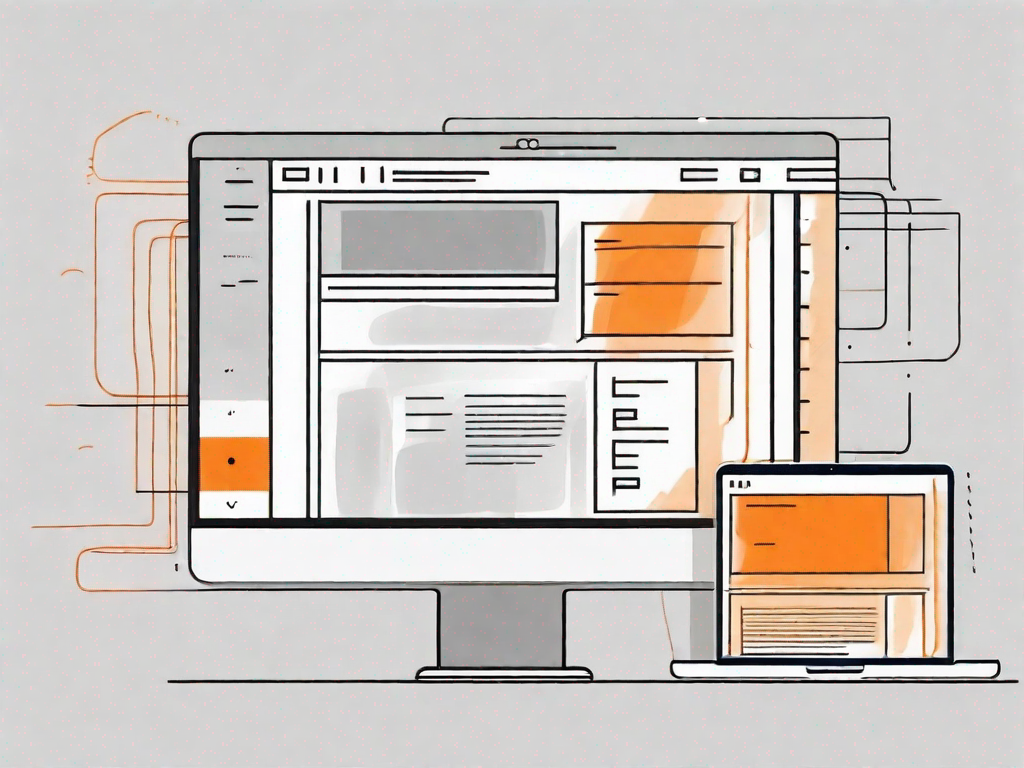
How to design a sticky sidebar in Webflow
.svg)
Webflow is a powerful web design platform that allows users to create beautiful and functional websites without any coding knowledge. One of the popular features that can greatly enhance the user experience is a sticky sidebar. In this article, we will explore the concept of a sticky sidebar and provide a step-by-step guide on how to design one in Webflow.
Understanding the Concept of a Sticky Sidebar
A sticky sidebar is a navigation element that remains fixed on the screen while the rest of the page scrolls. It provides quick access to important information or links, ensuring that users can easily navigate through the website's content without having to scroll back to the top of the page.
Imagine you're browsing through a website, reading an interesting article or exploring various sections. Suddenly, you realize you need to go back to the top of the page to access the navigation menu or find a specific link. It can be quite frustrating, right? Well, that's where a sticky sidebar comes to the rescue!
A sticky sidebar is like a loyal companion that sticks with you throughout your browsing journey. It's that vertical column on the side of a web page that remains visible as you scroll up or down. It's like having a personal assistant who keeps all the important information within arm's reach, making your browsing experience smoother and more convenient.
What is a Sticky Sidebar?
A sticky sidebar is a vertical column on the side of a web page that remains visible as the user scrolls. It typically contains navigation menus, social media icons, or other relevant information that needs to be easily accessible throughout the browsing experience.
Let's take a closer look at what you might find in a sticky sidebar. Firstly, it often includes a navigation menu. This menu allows users to effortlessly explore different sections of the website, jump to specific pages, or access various features. With a sticky sidebar, you don't have to worry about losing track of where you are or getting lost in the vastness of the website.
In addition to the navigation menu, a sticky sidebar may also feature social media icons. These icons provide quick links to the website's social media profiles, allowing users to easily connect, follow, or share content on their preferred platforms. It's like having a virtual bridge that connects the website to its social media presence, fostering engagement and interaction.
Importance of a Sticky Sidebar in Web Design
A sticky sidebar can significantly improve the usability of a website. It allows users to access important content or features without having to scroll back to the top of the page. This can be especially useful for websites with long-form content, multiple sections, or complex navigation structures.
Imagine you're reading an extensive article on a website. The content is so captivating that you find yourself scrolling down, engrossed in every word. Suddenly, you remember that you need to access the navigation menu to explore other sections or find related articles. With a sticky sidebar, you don't have to interrupt your reading flow or scroll back to the top. The navigation menu is right there, patiently waiting for you to make your next move.
By keeping essential information within reach at all times, a sticky sidebar enhances user convenience and reduces frustration. It can also help to increase engagement and conversions, as users are more likely to interact with the website when the navigation is easily accessible.
Furthermore, a sticky sidebar can be particularly beneficial for websites with complex navigation structures. It simplifies the browsing experience by providing a constant reference point, ensuring that users can effortlessly navigate through different sections, categories, or pages. It's like having a reliable compass that guides you through the website's intricate maze.
In conclusion, a sticky sidebar is a valuable tool in web design. It enhances usability, improves user experience, and boosts engagement. So, the next time you come across a website with a sticky sidebar, take a moment to appreciate the convenience it offers and the thoughtful design behind it.
Getting Started with Webflow
Before we dive into designing a sticky sidebar, let's briefly introduce Webflow and its key features that make it a great choice for this task.
Introduction to Webflow
Webflow is a visual web design tool that allows designers to create responsive websites without writing code. It offers a user-friendly interface, drag-and-drop functionality, and a range of design elements and templates to choose from. With Webflow, you have full control over your website's design and can easily customize every aspect to suit your needs.
Key Features of Webflow for Designing Sidebars
Webflow provides several features that make it ideal for designing a sticky sidebar:
- Flexbox: Webflow's built-in Flexbox feature enables you to create flexible and responsive layouts for your sidebar.
- Interactions: Webflow's interaction capabilities allow you to add animations and scroll-triggered effects to your sticky sidebar, making it more interactive and engaging.
- Responsive Design: Webflow automatically generates responsive code, ensuring that your sticky sidebar looks great on all devices, from desktop to mobile.
Step-by-Step Guide to Designing a Sticky Sidebar
Now that we have a good understanding of the concept and the tools at our disposal, let's start designing our sticky sidebar in Webflow.
Setting Up Your Webflow Project
The first step is to create a new project in Webflow. Choose a template or start from scratch, depending on your preference. Once your project is set up, you can begin designing the sidebar layout.
Creating the Sidebar Layout
To create the sidebar layout, you will need to add a new section or container element to your page. Set the width and height of the sidebar according to your design requirements. You can use Webflow's intuitive visual interface to easily position and style the elements within the sidebar.
Making the Sidebar Sticky
To make the sidebar sticky, select the sidebar element and enable the "Sticky" option in the position settings. This will ensure that the sidebar remains fixed on the screen as the user scrolls. Fine-tune the sticky behavior by adjusting the offset and other settings to suit your needs.
Customising Your Sticky Sidebar
Now that you have created the basic structure of your sticky sidebar, it's time to customize it and add content.
Adding Content to Your Sidebar
Decide what information or features you want to include in your sidebar and add relevant content. This could be navigation menus, social media icons, search bars, or any other elements that you feel would enhance the user experience. Keep in mind that the content should be concise and easily scannable.
Styling Your Sidebar
Use Webflow's powerful styling options to customize the appearance of your sidebar. Choose colors, fonts, and spacing that align with your website's overall design. Experiment with different styles to find the look that best suits your branding and user preferences.
Troubleshooting Common Issues
While designing a sticky sidebar in Webflow is relatively straightforward, you may encounter some challenges along the way. Here are a couple of common issues and how to address them:
Dealing with Overlapping Elements
If your sidebar overlaps with other content on the page, adjust the z-index property to ensure that the sidebar appears above other elements. You can also adjust the positioning or margins of surrounding elements to create enough space for the sidebar.
Ensuring Sidebar Responsiveness
As mobile devices have become the primary means of accessing the internet, it's crucial to ensure that your sticky sidebar is responsive and looks great on smaller screens. Use Webflow's responsive design tools to optimize the layout and styling of your sidebar for different screen sizes.
Congratulations! You now have a comprehensive understanding of how to design a sticky sidebar in Webflow. By implementing this powerful feature, you can enhance the usability and user experience of your website. Explore Webflow's vast capabilities and unleash your creativity to design stunning and functional sidebars that will impress your visitors.


Let's
Let’s discuss how we can bring reinvigorated value and purpose to your brand.
.svg)