
.svg)
How to design a responsive tab system in Webflow
.svg)
In today's digital age, having a functional and visually appealing website is crucial for any business or individual seeking an online presence. With the advancement of technology and the increasing use of mobile devices, it is more important than ever to ensure that your website is responsive and adaptable to different screen sizes. One effective way to achieve this is by designing a responsive tab system in Webflow, a powerful web design tool that allows you to create stunning websites without the need for coding.
Understanding the Basics of Webflow
Before diving into the specifics of designing a responsive tab system in Webflow, it is essential to have a good grasp of the basics. So, what exactly is Webflow? In simple terms, Webflow is a web design and development tool that empowers users to build professional and interactive websites with ease. It combines the simplicity of visual design with the flexibility of custom code, giving you the freedom to create unique and tailored websites.
Webflow offers a range of key features that set it apart from other web design platforms. Firstly, it provides a clean and intuitive interface, making it suitable for both beginners and experienced designers. Additionally, Webflow allows you to design websites visually, giving you full control over every aspect of your site's layout and design.
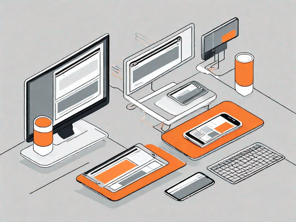
One of the standout features of Webflow is its built-in responsive design capabilities. With mobile devices becoming the primary means of accessing the internet, it is essential for your website to look and function flawlessly on different screen sizes. Webflow's responsive design tools enable you to create a website that seamlessly adapts to various devices, ensuring an optimal user experience for all visitors.
Furthermore, Webflow offers a wide range of pre-designed templates and components that can be easily customized to suit your needs. Whether you're looking to create a portfolio website, an e-commerce store, or a blog, Webflow has you covered. These templates not only save you time but also serve as a starting point for your own unique designs.
Another advantage of using Webflow is its ability to generate clean and efficient code. Unlike other website builders that produce bloated and messy code, Webflow ensures that the code it generates is optimized for performance and search engine visibility. This means that your website will load quickly and rank well in search engine results, giving you a competitive edge in the online world.
Moreover, Webflow offers seamless integration with popular third-party tools and services. Whether you need to connect your website to a CRM system, set up an email marketing campaign, or integrate with social media platforms, Webflow makes it easy to do so. This level of integration allows you to streamline your workflow and enhance the functionality of your website.
Additionally, Webflow provides a robust hosting infrastructure that ensures your website is fast, secure, and reliable. With Webflow hosting, you don't have to worry about server maintenance or security updates. Webflow takes care of all the technical aspects, allowing you to focus on creating and managing your website content.
In conclusion, Webflow is a powerful web design and development tool that offers a range of features and benefits. From its intuitive interface and visual design capabilities to its responsive design tools and clean code generation, Webflow empowers users to create stunning and functional websites. Whether you're a beginner or an experienced designer, Webflow provides the tools and flexibility you need to bring your web design ideas to life.
Getting Started with Webflow
Before you can start designing a responsive tab system in Webflow, you need to set up your Webflow account. Simply head over to the Webflow website and follow the straightforward sign-up process. Once you have created your account, you will have access to the Webflow interface, where you can begin crafting your website.
Navigating the Webflow interface may seem overwhelming at first, but it is relatively straightforward once you get the hang of it. The interface is divided into different sections, including the Design section, where you can visually create your website's layout, and the Style section, where you can customize the design elements and add your own personal touch.
Designing a Tab System in Webflow
A tab system is a user interface element that allows visitors to navigate through different sections or categories of content within a single webpage. It is a popular and efficient way to organize information and enhance the user experience. Designing a tab system in Webflow is surprisingly simple and can be done in just a few steps.
Defining a Tab System
The first step in designing a tab system in Webflow is to define the structure and layout of your tabs. Decide on the number of tabs you want to include and determine their positioning on the webpage. You can choose between horizontal or vertical tabs, depending on the overall design of your website.
Steps to Create a Tab System
Once you have defined the structure of your tab system, you can start building it using Webflow's intuitive design tools. Create a container element to hold your tabs and then add individual tab elements within the container. Customize the appearance of each tab to make them visually appealing and ensure they stand out to users.
Next, create the content for each tab. Within the same container, add div blocks for each tab's content and style them accordingly. You can include text, images, or any other type of content that is relevant to your website or webpage. Utilize Webflow's design features to make your content visually appealing and engaging.
To make your tab system functional, you will need to incorporate interactions. Webflow allows you to create interactions easily, even without any coding knowledge. Add interactions to your tabs, such as switching between content when a tab is clicked or hovered over, to provide a seamless user experience.
Making Your Tab System Responsive
Designing a beautiful tab system is one thing, but making it responsive is crucial to ensure that it looks great on different devices. Responsive design is the practice of creating websites that adapt and respond to various screen sizes, allowing for optimal viewing and user experience regardless of the device being used.
The Concept of Responsive Design
When it comes to making your tab system responsive, it is important to understand the concept of responsive design. Responsive design involves utilizing CSS media queries and flexible layouts to ensure that your website responds accordingly to different screen sizes. This means that the content within your tab system will reposition and resize to fit the screen, optimizing the user experience.
Applying Responsive Design to Your Tab System
Webflow makes it easy to apply responsive design techniques to your tab system. Use the built-in responsive design features to adjust the sizing, positioning, and styling of your tabs and content. Preview your tab system on different devices to ensure it looks and functions flawlessly across all screen sizes.
Troubleshooting Common Issues
As with any web design project, you may encounter some common issues when designing a tab system in Webflow. It is important to be aware of these issues and know how to troubleshoot them effectively.
Common Problems in Designing Tab Systems
One common problem that may arise when designing tab systems is the content overflowing outside the tab container, especially on mobile devices with smaller screens. To address this issue, you can use Webflow's responsive breakpoints to adjust the layout and content styling for smaller screens, ensuring everything fits neatly within the designated space.
Tips for Effective Troubleshooting
When troubleshooting issues with your tab system, it is often helpful to break down the problem and tackle it step by step. Start by checking your CSS styles and interactions to ensure they are correctly applied. Test your tab system on various devices and browsers to identify any inconsistencies or errors. Webflow offers extensive support resources, including forums and tutorials, which can provide valuable insights and solutions to common design issues.
In conclusion, designing a responsive tab system in Webflow is an excellent way to enhance your website's user experience and functionality. By understanding the basics of Webflow, setting up your account, and utilizing its design features, you can easily create a visually stunning tab system that adapts seamlessly to different devices. Remember to apply responsive design principles and troubleshoot any common issues that may arise. With Webflow's user-friendly interface and responsive design capabilities, designing a tab system has never been easier.


Let's
Let’s discuss how we can bring reinvigorated value and purpose to your brand.
.svg)