.svg)
How to design a responsive pricing section in Webflow
.svg)

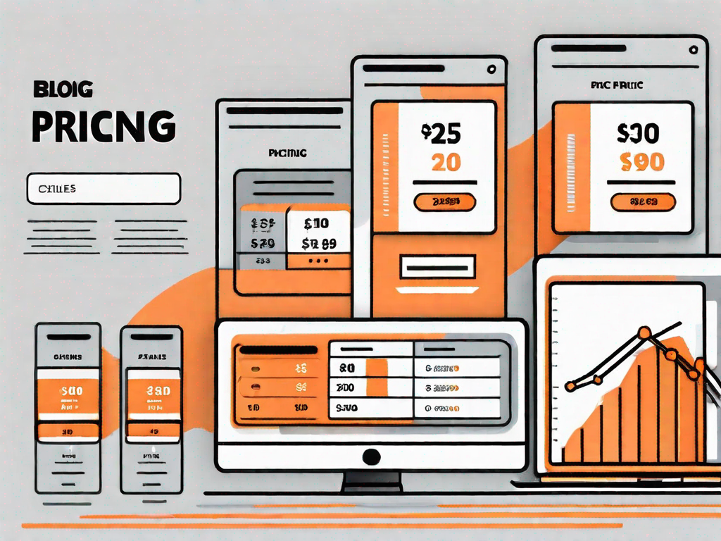
In today's digital world, having a responsive website is essential. With the increasing use of mobile devices, it has become imperative for businesses to ensure that their websites are accessible and user-friendly on all screen sizes. One crucial element of a responsive website is the pricing section, as it plays a vital role in converting visitors into customers. In this article, we will explore how to design a responsive pricing section in Webflow, a popular website design tool.
Understanding the Basics of Webflow
Before we dive into designing a responsive pricing section, it is essential to have a basic understanding of Webflow. Webflow is a visual development platform that allows users to design, build, and launch responsive websites without needing to write code. With its intuitive interface and powerful features, Webflow has become a preferred choice for many web designers and developers.
Webflow offers a wide range of tools and functionalities that make the web design process seamless and efficient. Whether you are a beginner or an experienced designer, Webflow provides a user-friendly environment that caters to all skill levels. From drag-and-drop functionality to advanced interactions and animations, Webflow empowers designers to bring their creative visions to life.
One of the standout features of Webflow is its ability to generate clean and semantic code. This means that the websites created using Webflow are not only visually stunning but also optimized for search engines. This is a significant advantage as it helps improve the website's visibility and ranking in search engine results.
The Importance of Responsive Design
Responsive design is a design approach that ensures a website adapts and displays correctly on different devices and screen sizes. In today's mobile-first world, where the majority of internet users browse the web on their smartphones and tablets, having a responsive website is crucial for providing an optimal user experience. A responsive pricing section allows potential customers to view and compare pricing options easily, without any usability issues.
When it comes to responsive design, Webflow shines. With its built-in responsive design tools, designers can effortlessly create websites that look great on any device. Webflow's responsive design capabilities allow you to customize the layout, typography, and images for different screen sizes, ensuring that your pricing section looks perfect on desktops, tablets, and mobile devices.
Furthermore, Webflow's responsive design features also enable designers to create fluid and dynamic animations that enhance the user experience. By utilizing responsive design principles, you can create pricing sections that not only display information effectively but also engage and captivate your audience.
Getting to Know Webflow's Interface
Before we proceed with designing the pricing section, let's take a quick tour of Webflow's interface. Webflow provides a user-friendly interface that allows designers to easily navigate through different design elements and settings. Familiarizing yourself with the interface will help you design and customize the pricing section efficiently.
Webflow's interface is divided into various sections, each serving a specific purpose. The Designer section is where you create and design your website visually. Here, you can add elements, adjust their properties, and arrange them on the canvas. The Navigator panel on the left side of the interface allows you to view and organize the structure of your website, making it easy to manage complex designs.
In addition to the Designer section, Webflow also provides a powerful Editor section. The Editor allows you to make changes to your website's content without affecting the design. This is particularly useful when you need to update text, images, or other content elements on your pricing section without altering the overall layout.
Webflow's interface also includes a Style Manager, which allows you to define and manage the styles used throughout your website. With the Style Manager, you can create global styles that can be applied to multiple elements, ensuring consistency and efficiency in your design process.
By exploring and familiarizing yourself with Webflow's interface, you'll be able to harness the full potential of this powerful web design platform. With a solid understanding of the interface, you'll be ready to create a stunning and responsive pricing section that will impress your audience.
Planning Your Pricing Section
Before jumping into the design process, it is essential to plan your pricing section carefully. A well-planned pricing section will not only attract potential customers but also provide clarity and ease of use. This section will discuss two crucial aspects to consider: defining your pricing structure and considering user experience.
Defining Your Pricing Structure
The first step in planning your pricing section is to define your pricing structure. Consider the products or services you offer and the pricing options available. It is essential to categorize your offerings into logical tiers or packages to simplify the decision-making process for your potential customers.
Considering User Experience
When planning your pricing section, it is crucial to put yourself in the shoes of your potential customers. Consider their needs, preferences, and pain points. This will help you design a pricing section that provides a seamless user experience, making it easy for them to understand your offerings and make a purchase decision.
Designing Your Pricing Section in Webflow
With your planning in place, it's time to dive into the design process. Webflow offers a range of design tools and features that enable you to create stunning and responsive pricing sections for your website.
Utilising Webflow's Design Tools
Webflow provides a variety of design tools that allow you to customize the appearance of your pricing section. From typography to color schemes and layout options, Webflow offers endless possibilities to match your branding and create an appealing pricing section.
Implementing Responsive Design Principles
As we mentioned earlier, responsive design is key to ensuring your pricing section looks great on all devices. Webflow simplifies the process of creating a responsive pricing section by providing responsive settings and breakpoints. By leveraging these features, you can ensure that your pricing section adapts to different screen sizes, making it accessible to a wider audience.
Testing and Refining Your Pricing Section
Once you have designed your pricing section, it is vital to test its responsiveness and make any necessary adjustments. Testing your pricing section across various devices and screen sizes will help you identify any usability issues and ensure a seamless experience for your potential customers.
Conducting Responsiveness Checks
Testing the responsiveness of your pricing section involves viewing it on different devices, such as smartphones, tablets, and desktop computers. Pay attention to layout, font sizes, and any design elements that may not display correctly on certain screen sizes. Make notes of any issues you encounter to guide your refinements.
Making Necessary Adjustments
Based on your responsiveness checks, make the necessary adjustments to your pricing section. This may involve tweaking the layout, adjusting font sizes, or resizing images. By addressing these issues, you will ensure that your pricing section provides a consistent and visually appealing experience across all devices.
Final Thoughts on Webflow Pricing Section Design
Designing a responsive pricing section in Webflow requires careful planning, thoughtful design choices, and meticulous testing. Here are some best practices to keep in mind as you embark on this process:
Best Practices to Remember
- Keep the design clean and uncluttered for easy comprehension.
- Use clear and concise language to describe your pricing options.
- Ensure that pricing information is easily scannable.
- Add visual cues, such as icons or badges, to highlight key features or discounts.
Avoiding Common Pitfalls
- Avoid overwhelming potential customers with too many pricing options.
- Avoid using jargon or technical terms that may confuse your audience.
- Avoid hiding important pricing information behind multiple clicks.
- Avoid inconsistent design elements that may compromise user experience.
By following these best practices and avoiding common pitfalls, you can create a responsive pricing section in Webflow that not only engages potential customers but also drives conversions for your business.
In conclusion, designing a responsive pricing section in Webflow is a critical aspect of creating a successful and user-friendly website. By understanding the basics of Webflow, carefully planning your pricing section, utilizing Webflow's design tools, and testing and refining your work, you can create an engaging pricing section that converts visitors into paying customers. Remember to follow best practices and avoid common pitfalls to ensure an optimal user experience. Start designing your responsive pricing section today and unlock the potential of your website.
Related Posts
Let's
Let’s discuss how we can bring reinvigorated value and purpose to your brand.


.svg)