.svg)
How to design a responsive order history page in Webflow
.svg)

In today's digital age, creating a user-friendly and responsive order history page is crucial for any e-commerce website. It not only provides your customers with easy access to their past purchases, but it also plays a significant role in enhancing their overall user experience. In this article, we will delve deep into the importance of a responsive order history page and guide you through the process of designing one using Webflow, a powerful web design platform.
Understanding the Importance of a Responsive Order History Page
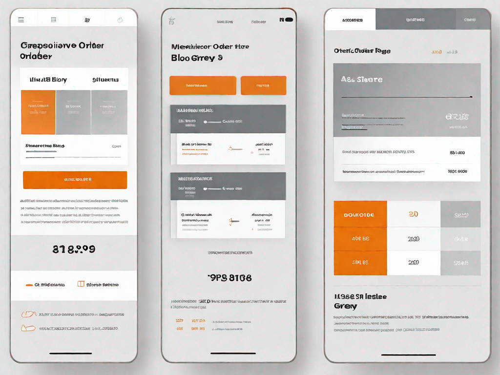
A well-designed order history page is more than just a record of past transactions. It serves as a portal for customers to track their purchases, view order details, and even initiate returns or exchanges. By making this page responsive, i.e., optimised for various screen sizes and devices, you ensure that your customers can access their order history seamlessly, regardless of whether they are browsing from their desktop, tablet, or smartphone.
Not only does a responsive order history page provide convenience and accessibility to your customers, but it also reflects positively on your brand. By demonstrating your commitment to user experience and customer satisfaction, you build trust and establish a reputation for being a forward-thinking and customer-centric company.
The Role of Order History in User Experience
Order history is a vital aspect of the overall user experience on an e-commerce website. It allows customers to revisit their past purchases, track their packages, and review order details such as pricing, billing addresses, and item descriptions. By making this information easily accessible and navigable, you empower your customers to take control of their orders and resolve any potential issues swiftly.
In addition to its practical value, order history also has a psychological impact on your customers. It provides them with a sense of security and confidence in their purchase decisions. Knowing that they can easily refer back to their order history fosters trust in your brand and encourages repeat purchases.
The Benefits of a Responsive Design
Responsive design is an approach to web design that ensures optimal functionality and aesthetics across various devices and screen sizes. When applied to an order history page, responsive design offers several key benefits.
- Improved User Experience: A responsive order history page adjusts effortlessly to different screen resolutions, making it easy for users to navigate and interact with the page.
- Increased Mobile Traffic: With the rise of mobile browsing, having a responsive order history page ensures that you cater to a larger audience and capitalize on the growing mobile e-commerce market.
- Enhanced SEO: Responsive design is favored by search engines because it provides consistent content across devices. This can result in improved search engine rankings and increased organic traffic to your order history page.
Getting Started with Webflow
Before diving into the design process, let's familiarize ourselves with Webflow's intuitive interface and its key features relevant to designing pages, particularly a responsive order history page.
An Introduction to Webflow's Interface
Webflow offers a user-friendly interface that allows you to design and build websites visually, without the need for coding. The platform provides a vast collection of pre-designed components, templates, and interactions that simplify the design process. The intuitive drag-and-drop editor, coupled with the real-time preview, enables you to see your changes instantly and fine-tune your design.
Additionally, Webflow's responsive design editor allows you to customize your order history page for different screen sizes, ensuring an optimal viewing experience for your customers, regardless of the device they use.
Key Webflow Features for Designing Pages
When creating a responsive order history page in Webflow, several features are worth exploring:
- Grid System: Webflow's responsive grid system empowers you to create well-structured layouts for your order history page, enabling effective placement of elements and a seamless browsing experience.
- Flexbox: Flexbox provides a flexible and powerful way to align and distribute elements within containers on your order history page, ensuring consistency and responsiveness.
- Interactions: Webflow's interactions feature allows you to add dynamic and engaging animations to your order history page, making the user experience more immersive and memorable.
- Forms: A responsive order history page may include forms for submitting returns or exchanges. Webflow's form builder simplifies the process of creating and styling these forms.
Designing Your Order History Page
Now that we have covered the fundamentals, let's focus on the design process for your order history page. It is crucial to plan your page layout carefully to ensure that the information is presented clearly and intuitively to your customers.
Planning Your Page Layout
Begin by identifying the essential elements that need to be included on your order history page. These may include order numbers, dates, item descriptions, prices, and tracking links. Once you have determined the key components, consider how they can be organized in a visually pleasing and easy-to-read manner. Utilizing Webflow's grid system and flexbox features can help you achieve a balanced layout.
Remember to consider the user journey as you plan the page. Intuitive navigation and clear calls-to-action will guide customers seamlessly through their order history.
Choosing the Right Webflow Components
Webflow provides an extensive range of pre-designed components that you can customize to suit your order history page. Experiment with different styles, typography, and colors to create a visually appealing and cohesive design. Focus on consistency in order to maintain a recognisable and user-friendly experience across all devices.
Making Your Order History Page Responsive
Ensuring that your order history page is responsive is crucial in today's mobile-dominated landscape. Responsive design allows your page to adapt and look visually appealing on a variety of devices and screen sizes. Thankfully, Webflow makes implementing responsive design techniques a breeze.
Understanding Responsiveness in Webflow
Webflow's responsive design editor enables you to fine-tune the appearance and behaviour of your order history page for each specific breakpoint, from desktop to mobile. You can easily resize and rearrange elements to ensure a seamless and visually pleasing experience across all devices.
Implementing Responsive Design Techniques
When designing your order history page, consider the following techniques to ensure responsiveness:
- Flexible Layout: Utilize Webflow's grid system and flexbox features to create fluid and adaptable layouts that adjust to different screen sizes.
- Responsive Typography: Experiment with font sizes and line heights to ensure readability on smaller screens, while maintaining legibility on larger screens.
- Mobile-first Design: Start designing your order history page with a mobile-first approach, gradually enhancing it for larger screens. This ensures optimal usability and a smooth transition across all devices.
- Media Queries: Leverage Webflow's media queries to apply specific styles and optimize layouts based on different screen sizes.
Testing Your Order History Page
Once you have designed your responsive order history page, it is crucial to thoroughly test its performance and functionality across various devices and screen sizes.
Ensuring Responsiveness Across Devices
Test your order history page on different devices, such as smartphones, tablets, and desktop computers. Ensure that all elements are displayed correctly and that the user experience remains consistent and intuitive. Pay attention to page load times, font legibility, and the alignment of elements.
Troubleshooting Common Issues
If you encounter any issues during testing, identify the problem areas and make the necessary adjustments. Common issues may include overlapping elements, text truncation, or misaligned layouts. Webflow's detailed documentation and community forums can provide valuable guidance in addressing these challenges.
In conclusion, designing a responsive order history page is essential for delivering an exceptional user experience to your customers. By understanding the importance of a responsive design, familiarizing yourself with Webflow's interface and key features, and implementing responsive techniques, you can create a visually appealing and functional order history page that caters to users on all devices. Remember to test your page thoroughly to ensure a seamless browsing experience and troubleshoot any issues that may arise. Happy designing in Webflow!
Related Posts
Let's
Let’s discuss how we can bring reinvigorated value and purpose to your brand.


.svg)