.svg)
How to design a responsive modal in Webflow
.svg)

Webflow is an incredibly versatile web design tool that allows users to create custom websites without any coding knowledge. Its intuitive drag-and-drop interface makes it accessible to beginners, while its powerful features make it a favorite among professional web designers. One of the many features that set Webflow apart is its ability to create responsive modals. In this article, we will explore the basics of Webflow, the importance of responsive modals, and provide a step-by-step guide to designing your own modal.
Understanding the Basics of Webflow
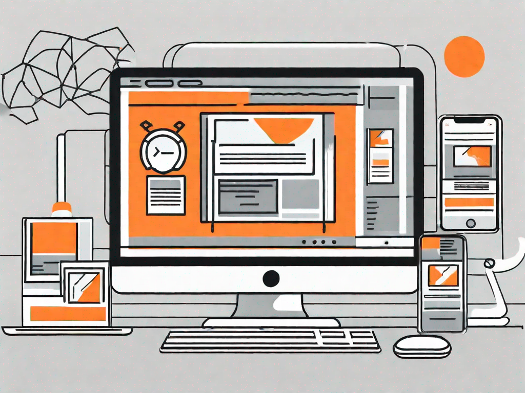
If you're new to Webflow, it's essential to understand what it is and how it works. Webflow is a cloud-based website builder that enables users to design, build, and launch websites without touching a line of code. Its visual interface allows designers to create responsive websites that work seamlessly across different devices and screen sizes. With Webflow, you have complete control over every aspect of your website's design, from layout and typography to interactions and animations.
What is Webflow?
Webflow is a web design and development platform that lets users create websites visually, using a drag-and-drop interface. It combines the ease of use of a visual builder with the flexibility and power of a code editor. Webflow generates clean, semantic code behind the scenes, which makes it SEO-friendly and performant.
Key Features of Webflow
Webflow offers a wide range of features that empower designers to create stunning and functional websites. Here are some of the key features:
- Responsive Design: With Webflow, you can easily create responsive websites that adapt to different screen sizes.
- Drag-and-Drop Interface: Webflow's intuitive interface allows you to build your website by dragging elements onto the canvas.
- Interactions and Animations: Bring your website to life with interactive elements and smooth animations.
- Customizable Templates: Start your design process with a pre-designed template and customize it to fit your needs.
- E-commerce Functionality: Design and launch online stores with ease using Webflow's built-in e-commerce tools.
The Importance of Responsive Modals
Responsive modals play a crucial role in enhancing the user experience on your website. A modal is a box or pop-up window that appears on top of the content, usually triggered by a button or a link. They are commonly used for displaying additional information, capturing user input, or showing important notifications. By designing your modals to be responsive, you ensure they look great and function properly on different screen sizes, from desktops to mobile devices.
Defining Responsive Modals
A responsive modal is one that adapts its size and layout to fit the screen it is being viewed on. It adjusts its dimensions, fonts, and spacing to ensure readability and usability across various devices. Responsive modals are a must-have feature in today's mobile-first world, where users access websites from a wide range of devices with different screen sizes and resolutions.
Why Use Responsive Modals?
There are several reasons why using responsive modals is beneficial for your website:
- Better User Experience: Responsive modals ensure that your users can easily read and interact with the content, regardless of the device they are using.
- Increased Conversion Rates: A well-designed modal can catch the user's attention and encourage them to take the desired action, such as signing up for a newsletter or making a purchase.
- Improved Accessibility: Responsive modals make your website more accessible to users with disabilities, as they can adjust the modal's size and content based on their needs.
- Consistent Branding: By designing your modal to be responsive, you maintain a consistent brand experience across all devices, reinforcing your brand identity in the minds of your users.
Getting Started with Your Modal Design
Now that you understand the basics of Webflow and the importance of responsive modals, it's time to get started with designing your own modal. Before diving into the design process, there are a few steps you need to follow:
Setting Up Your Webflow Account
To get started with Webflow, you'll need to sign up for an account. Visit the Webflow website and follow the instructions to create your account. Once you've signed up, you'll have access to the Webflow Designer and Editor, where you can start building your website and modals.
Navigating the Webflow Interface
The Webflow interface consists of several key sections that you'll need to familiarize yourself with:
- Dashboard: The dashboard is where you'll find an overview of all your projects and access the editor and designer.
- Designer: The designer is where you'll create and design your website and modals. It's where you'll spend most of your time during the design process.
- Editor: The editor is where you'll make content changes and manage your website's CMS (Content Management System).
- Assets: The assets panel is where you'll upload and manage all your project's media files, such as images and videos.
Step-by-Step Guide to Designing a Responsive Modal
Now that you have a solid foundation of Webflow knowledge and have set up your account, it's time to dive into the step-by-step process of designing your responsive modal.
Planning Your Modal Design
Before you jump into the designer, take some time to plan out your modal design. Consider the purpose of your modal and what information you want to convey to the user. Sketch out a rough wireframe on paper or using a digital design tool to visualize the layout and structure of your modal.
Creating Your Modal in Webflow
Once you have a clear plan in mind, it's time to create your modal in the Webflow Designer. Follow these steps:
- Open the Webflow Designer and select the project you want to work on.
- Navigate to the page where you want to place your modal or create a new page specifically for the modal.
- Add a new section or div block to your page. This will serve as the container for your modal.
- Within the container, add the necessary elements, such as text, images, or buttons, to create the content of your modal.
- Style the elements using Webflow's visual styling tools to match your design vision.
Making Your Modal Responsive
With your modal designed, it's now time to make it responsive. Follow these best practices to ensure your modal looks great on all devices:
- Use percentage-based widths and heights for your modal and its content to allow it to adapt to different screen sizes.
- Set maximum and minimum widths and heights to prevent the modal from becoming too small or too large on different devices.
- Adjust font sizes and line heights to ensure readability on smaller screens.
- Test your modal on different devices and screen sizes to identify any issues and make necessary adjustments.
Testing Your Responsive Modal
Before launching your website, it's crucial to thoroughly test your responsive modal to ensure it works flawlessly on all devices. Here's how you can test your modal's responsiveness:
How to Test Your Modal's Responsiveness
Follow these steps to test your modal and identify any responsiveness issues:
- Preview your website in the Webflow Designer and select different device sizes to see how your modal behaves.
- Open your website on actual devices, such as smartphones and tablets, to see how the modal appears in real-world scenarios.
- Use web testing tools or browser developer tools to simulate different device sizes and test your modal's responsiveness.
- Solicit feedback from colleagues, friends, or beta testers, and make necessary adjustments based on their insights.
Troubleshooting Common Issues
While designing and testing your responsive modal, you may encounter some common issues. Here are a few troubleshooting tips:
- Ensure that all elements on your modal are properly aligned and don't overlap on smaller screens.
- Check for any excessive scrolling or hidden content within the modal on mobile devices.
- Verify that all links and buttons within your modal are easily tappable and functional on touchscreens.
- Test your modal in different orientations, such as landscape and portrait, to ensure it looks good in any scenario.
By following these troubleshooting tips, you can overcome any challenges that may arise during the design and testing process of your responsive modal.
In conclusion, designing a responsive modal in Webflow is a relatively straightforward process that can greatly enhance the user experience on your website. With Webflow's powerful features and intuitive interface, you have all the tools you need to create stunning and functional modals that work seamlessly across different devices. By incorporating responsive design principles and best practices, you can ensure your modal looks great and functions flawlessly on desktops, tablets, and smartphones. So, why wait? Dive into Webflow and start designing your responsive modal today!
Related Posts
Let's
Let’s discuss how we can bring reinvigorated value and purpose to your brand.


.svg)