.svg)
How to design a responsive masonry layout in Webflow
.svg)

Webflow is a powerful and versatile web design tool that allows you to create stunning websites without writing a single line of code. With its intuitive interface and extensive range of features, Webflow has become a go-to choice for designers and developers alike. In this article, we will delve into the basics of Webflow and explore the concept of masonry layout, providing you with a step-by-step guide to designing a responsive masonry layout in Webflow.
Understanding the Basics of Webflow
Webflow is a cloud-based website design platform that empowers users to create beautiful, responsive websites effortlessly. Whether you're a beginner or an experienced designer, Webflow combines the ease of drag-and-drop designing with the functionality of a powerful content management system, making it an ideal choice for your web design projects.
But what sets Webflow apart from other website design platforms? Let's take a closer look at some of its key features.
What is Webflow?
Webflow is a cloud-based website design platform that empowers users to create beautiful, responsive websites effortlessly. It combines the ease of drag-and-drop designing with the functionality of a powerful content management system, making it an ideal choice for both beginners and experienced designers.
Key Features of Webflow
Webflow offers a wide range of features that make it an attractive option for web design projects. Let's explore some of its key features:
- Responsive design capabilities: With an increasing number of users accessing websites on various devices, it is vital to ensure that your website looks and functions flawlessly across different screen sizes. Webflow's responsive design capabilities make it easy to create websites that adapt seamlessly to any screen.
- Intuitive drag-and-drop interface: Webflow's intuitive drag-and-drop interface allows you to easily create and customize your website's layout without any coding knowledge.
- Customizable templates: Webflow offers a wide range of customizable templates, allowing you to kickstart your web design projects with ease.
- Advanced styling options: With Webflow, you have full control over the styling of your website. Customize fonts, colors, and other design elements to create a unique and visually appealing website.
- Interaction and animation tools: Webflow provides powerful interaction and animation tools, allowing you to add engaging and interactive elements to your website.
- Effortless content management: With Webflow's content management system, you can easily update and manage your website's content without any hassle.
These features make Webflow a versatile and powerful tool for creating stunning websites that not only look great but also function seamlessly.
Importance of Responsive Design in Webflow
In today's mobile-driven world, responsive design is crucial. With an increasing number of users accessing websites on various devices, it is vital to ensure that your website looks and functions flawlessly across different screen sizes. Webflow's responsive design capabilities make it easy to create websites that adapt seamlessly to any screen.
By using Webflow's responsive design features, you can ensure that your website provides an optimal user experience, regardless of the device your visitors are using. Whether they're browsing on a smartphone, tablet, or desktop computer, your website will look and function beautifully.
With Webflow, you can create a website that not only meets the needs of your audience but also exceeds their expectations. So why wait? Start using Webflow today and unlock the full potential of your web design projects!
The Concept of Masonry Layout
The concept of masonry layout is a fascinating and innovative web design technique that has gained popularity in recent years. It revolutionizes the way elements are arranged on a webpage, creating a visually appealing and dynamic layout that captivates users.
Defining Masonry Layout
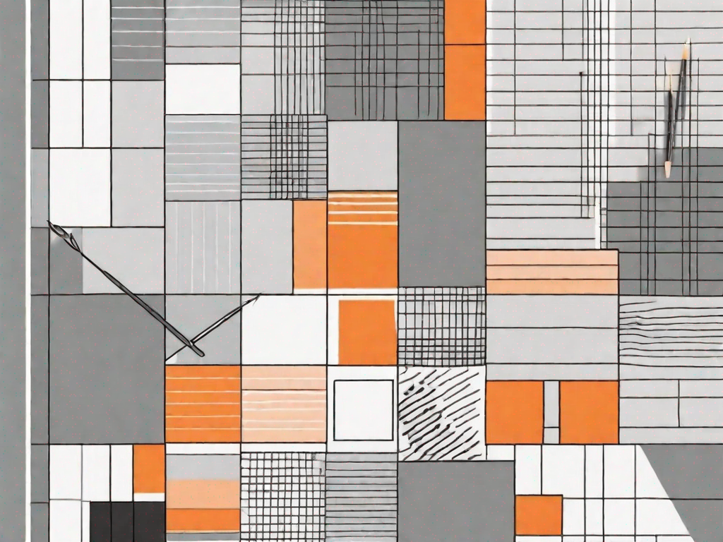
Masonry layout, also known as the Pinterest-style layout, is a technique that arranges elements in a grid-like structure, regardless of their height or width. Unlike traditional grid layouts, where elements are aligned in rows and columns, masonry layout offers more flexibility and aesthetic appeal.
Imagine a virtual wall where different-sized bricks are placed together, forming a visually striking pattern. Similarly, in masonry layout, elements are positioned based on available vertical space, resulting in a unique and captivating design.
Benefits of Using Masonry Layout
The benefits of using masonry layout are numerous and contribute to an enhanced user experience. Let's explore some of the key advantages:
- Improved Visual Appeal and Uniqueness: One of the most significant advantages of masonry layout is its ability to create visually stunning websites. By breaking away from the constraints of traditional grid layouts, masonry layout allows for a more creative and artistic presentation of content. The irregular arrangement of elements adds an element of surprise and uniqueness to the design, making it stand out from the crowd.
- Efficient Use of Space: Another advantage of masonry layout is its efficient use of space. Unlike traditional grid layouts, where elements are forced into fixed rows and columns, masonry layout optimizes the available space by filling gaps with elements of varying sizes. This ensures that no space is wasted, resulting in a more compact and visually appealing design.
- Responsive and Adaptable to Different Screen Sizes: In today's mobile-driven world, responsive design is crucial. Masonry layout excels in this aspect, as it automatically adjusts to different screen sizes and resolutions. Whether viewed on a large desktop monitor or a small smartphone screen, the masonry layout ensures that the design remains intact and visually appealing, providing a consistent user experience across devices.
- Ability to Showcase a Variety of Content Formats: Masonry layout is not limited to a specific type of content. It is highly versatile and can showcase various content formats, such as images, videos, articles, and more. This flexibility allows designers to create engaging and interactive websites that cater to different types of content and user preferences.
By harnessing the power of masonry layout, web designers can create visually stunning websites that captivate users and provide an exceptional browsing experience. Its unique arrangement of elements, efficient use of space, responsiveness, and versatility make it a valuable technique in the world of web design.
Steps to Design a Responsive Masonry Layout in Webflow
Setting Up Your Webflow Account
Before you can start designing your responsive masonry layout, you need to sign up for a Webflow account. Simply visit the Webflow website and follow the instructions to create your account.
Creating a New Project in Webflow
Once you have successfully set up your Webflow account, you can create a new project by clicking on the "Create New Project" button on your dashboard. Give your project a meaningful name and select a template or start from scratch.
Designing the Masonry Layout
With your project set up, it's time to start designing your responsive masonry layout. Here are the basic steps:
- Add a grid container to your layout
- Drag and drop elements into the grid container
- Adjust the size and positioning of each element
By following these steps, you can create a visually pleasing masonry layout that adapts beautifully to different screen sizes.
Making Your Masonry Layout Responsive
To ensure that your masonry layout looks great on all devices, you need to make it responsive. Webflow provides powerful responsive design tools to help you achieve this. Some key considerations to keep in mind include:
- Using media queries to adjust element sizes and positioning
- Optimizing image sizes for different devices
- Testing your layout on various screen sizes
Troubleshooting Common Issues
Dealing with Layout Issues
When designing a masonry layout, you may encounter some common issues, such as overlapping or misaligned elements. To resolve these issues, you can:
- Adjust the layout settings
- Check for conflicting styles
- Apply CSS fixes if necessary
By troubleshooting these layout issues, you can ensure that your masonry layout looks flawless and functions seamlessly.
Solving Responsiveness Problems
If your masonry layout doesn't appear as expected on different screen sizes, there are several steps you can take to address responsiveness problems:
- Review your media queries
- Test your layout on various devices
- Optimize your images for different screen resolutions
By carefully analyzing and fine-tuning your masonry layout, you can overcome any responsiveness issues and deliver a stellar user experience on all devices.
In conclusion, Webflow and masonry layout offer a powerful combination for creating visually stunning and responsive websites. By understanding the basics of Webflow and following the steps outlined in this article, you can design a responsive masonry layout that captivates your audience and leaves a lasting impression. So, why wait? Start exploring the possibilities with Webflow and take your web design skills to new heights!
Related Posts
Let's
Let’s discuss how we can bring reinvigorated value and purpose to your brand.


.svg)