.svg)
How to design a responsive customer order history page in Webflow
.svg)

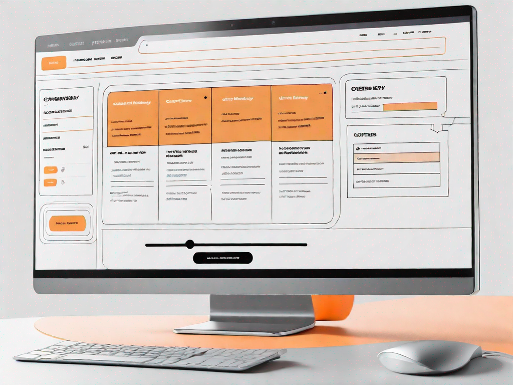
In today's digital age, having a well-designed and user-friendly website is crucial for businesses to thrive. One important aspect of a website that shouldn't be overlooked is the customer order history page. This page plays a vital role in enhancing the user experience and providing valuable insights for both customers and businesses. In this article, we will delve into the importance of having a responsive customer order history page and guide you on how to design one using the powerful web design tool, Webflow.
Understanding the Importance of a Responsive Order History Page
Before we dive into the technicalities of designing a responsive customer order history page, let's first understand why it matters in the first place. A responsive design ensures that your order history page adapts seamlessly to different screen sizes and devices, such as mobile phones, tablets, and desktops. This means that no matter how your customers access their order history, they will have a consistent and optimized experience.
But why is a consistent and optimized experience so crucial? Well, imagine this scenario: a customer is on the go, using their mobile phone to check their order history. They want to quickly find a specific order or track the delivery status of their latest purchase. However, if the order history page is not responsive, they may struggle to navigate through the cluttered interface or read the tiny text on their small screen. This frustrating experience could lead to customer dissatisfaction and even abandonment of your website.
On the other hand, a responsive order history page offers a seamless and user-friendly experience. It automatically adjusts its layout, font sizes, and images to fit the screen size of the device being used. This means that whether your customers are using a large desktop monitor or a compact smartphone, they can easily access and interact with their order history without any hassle.
The Role of a Customer Order History Page
A customer order history page serves as a valuable resource for both customers and businesses. For customers, it provides a comprehensive record of their purchases, allowing them to track their orders, view previous transactions, and easily reorder items. Imagine a customer who wants to repurchase a product they bought a few months ago. Instead of going through the entire shopping process again, they can simply visit their order history page, find the previous order, and reorder with just a few clicks. This convenience not only saves time but also enhances the overall shopping experience.
On the other hand, businesses can benefit greatly from a well-designed order history page. By analyzing customer behavior and patterns through the data collected in the order history, businesses can gain valuable insights. For example, they can identify popular products, understand customer preferences, and even predict future trends. Armed with this information, businesses can make data-driven decisions to improve their products and services, optimize their marketing strategies, and enhance customer satisfaction.
Moreover, a customer order history page can also serve as a tool for customer support. When customers have questions or issues regarding their orders, they can refer to their order history page for relevant information such as order numbers, tracking details, and contact information. This streamlines the support process and allows businesses to provide efficient and personalized assistance.
Benefits of a Responsive Design
A responsive customer order history page offers numerous benefits that can enhance the overall user experience. Firstly, it ensures that customers can access their order history seamlessly, regardless of the device they are using. Whether they are at home, in the office, or on the move, customers can conveniently check their order history and manage their purchases.
Secondly, a responsive design improves readability and navigation. With a well-optimized layout and font sizes, customers can easily scan through their order history, locate specific orders, and find relevant details such as order dates, item names, and prices. This eliminates the frustration of squinting at tiny text or zooming in and out to read the information.
Lastly, a responsive design boosts customer satisfaction and loyalty. When customers have a smooth and hassle-free experience accessing their order history, it reflects positively on your brand. It shows that you value their experience and invest in providing a seamless online journey. Satisfied customers are more likely to return to your website, make repeat purchases, and recommend your business to others.
In conclusion, a responsive customer order history page is not just a technical requirement but a crucial element in providing a seamless and user-friendly experience. By understanding the importance of responsiveness and optimizing your order history page, you can enhance customer satisfaction, improve business insights, and ultimately drive growth in your e-commerce business.
Getting Started with Webflow
Now that we understand the importance of a responsive order history page, let's explore Webflow, a powerful web design tool that will help us bring this concept to life. Webflow is a visual web design platform that allows designers to create websites without code. Its user-friendly interface and robust features make it an ideal choice for designing and developing responsive web pages.
An Introduction to Webflow
Webflow provides an intuitive drag-and-drop interface that simplifies the web design process. Unlike traditional web design tools, Webflow generates clean and efficient code, ensuring a smooth user experience across different devices. Whether you're a seasoned web designer or new to the field, Webflow offers a range of features that cater to designers of all skill levels.
Key Features of Webflow for Designing Pages
Webflow offers a plethora of features that make designing a responsive customer order history page a breeze. Some key features include:
- Responsive Grid System: Webflow's responsive grid system allows you to create fluid layouts that automatically adjust based on screen size.
- Custom Interactions: With Webflow's interactions feature, you can add animations and micro-interactions to your order history page, enhancing its visual appeal and usability.
- E-Commerce Integration: If you run an e-commerce business, Webflow seamlessly integrates with popular e-commerce platforms, making it easy to display and manage order history data.
Designing Your Customer Order History Page
Now that we have covered the basics of Webflow, let's dive into designing your customer order history page. Before you start implementing your design ideas, it's crucial to plan your page layout strategically. This will ensure that your customers can easily find the information they are looking for and have a seamless browsing experience.
Planning Your Page Layout
Start by mapping out the structure of your order history page. Consider the key elements you want to include, such as order details, delivery information, and payment history. Arrange these elements in a logical and intuitive manner, ensuring that important information is easily accessible.
Choosing the Right Components
Webflow offers a wide range of components that you can use to build your order history page. These components include headings, text blocks, buttons, and images. Carefully choose the components that align with your design aesthetic and provide a seamless user experience. Remember to keep visual consistency throughout the page to create a cohesive and professional look.
Making Your Page Responsive
Now comes the exciting part – making your customer order history page responsive. It's essential to consider how your page will appear on different devices and screen sizes. A truly responsive design ensures that your order history page looks and functions flawlessly on any device, whether it's a mobile phone, tablet, or desktop.
Understanding Responsiveness in Web Design
Responsive web design refers to the practice of creating websites that adapt to the user's screen size and orientation. This ensures that your page is visually appealing and easy to navigate, regardless of the device being used. In Webflow, you can achieve responsiveness by leveraging its built-in responsive design tools and features.
Implementing Responsive Design in Webflow
In Webflow, you can make your customer order history page responsive by using the built-in responsive grid system. This allows you to create flexible layouts that automatically adjust based on the screen size. Additionally, you can use Webflow's breakpoints feature to set specific design rules for different device sizes, ensuring a consistent experience across all devices.
Testing and Optimising Your Page
Now that you have designed and made your customer order history page responsive, it's time to test it to ensure it meets your expectations. Testing is a crucial step to identify any design or functionality issues and make the necessary optimizations.
How to Test Your Page's Responsiveness
Start by previewing your order history page on different devices and screen sizes. Pay attention to how the elements and components are displayed, and make adjustments if needed. Test the functionality of interactive elements such as buttons and links to ensure they work smoothly. It's also essential to test the page's loading speed to ensure a seamless browsing experience for your customers.
Tips for Optimising Your Order History Page
To optimize your customer order history page, pay attention to performance factors such as image optimization, CSS and JavaScript minification, and browser caching. Compressing images, minimizing code, and leveraging browser caching can significantly improve your page's loading speed. Additionally, consider user feedback and analytics to identify areas for improvement and continuously enhance your customer's browsing experience.
By following these steps and leveraging the power of Webflow, you can design a responsive customer order history page that enhances the user experience and provides valuable insights for your business. Remember to stay up to date with web design trends and regularly test and optimize your page to ensure it remains intuitive and efficient. With a well-designed and responsive order history page, you can build customer trust and loyalty, ultimately leading to an increase in conversions and repeat sales.
Related Posts
Let's
Let’s discuss how we can bring reinvigorated value and purpose to your brand.


.svg)