.svg)
How to design a responsive card layout in Webflow
.svg)
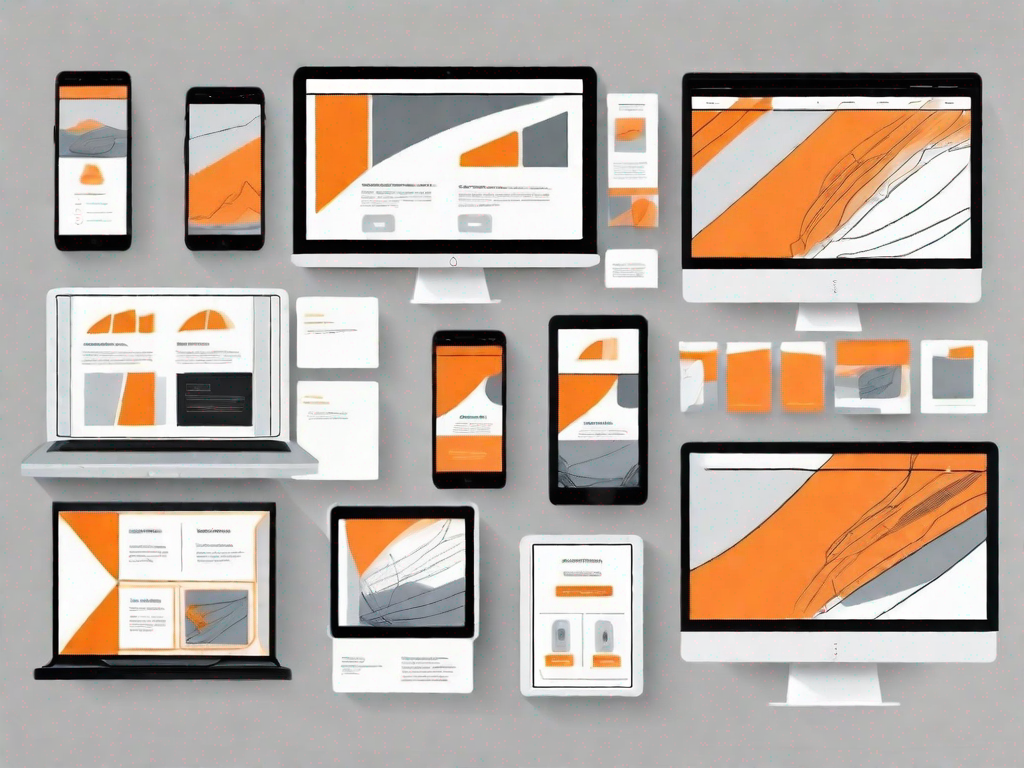
In this article, we will dive into the world of Webflow and explore the process of designing a responsive card layout. Webflow is a powerful platform that allows you to design and build websites without code. Whether you are a seasoned web designer or a newcomer to the field, Webflow provides a user-friendly interface that makes designing websites a breeze.
Understanding the Basics of Webflow
Before we delve into the details of designing a responsive card layout, let's take a moment to understand what Webflow is all about. Webflow is a visual development platform that combines the simplicity of drag-and-drop design with the power of HTML, CSS, and JavaScript. It allows you to create fully responsive websites that look great on any device.
Webflow is not just your average web design tool. It is a revolutionary platform that empowers designers to create beautiful and interactive websites without needing to write a single line of code. With Webflow, you can unleash your creativity and bring your design ideas to life.
What is Webflow?
Webflow is a web design tool that empowers designers to create beautiful and interactive websites without needing to write code. It provides a visual interface that allows you to design your website by manipulating elements on the canvas. You can also customize the layout, styles, and interactions to create a unique and engaging user experience.
Imagine having the power to design a website just by dragging and dropping elements onto a canvas. That's exactly what Webflow offers. Whether you're a seasoned designer or just starting out, Webflow makes the design process more intuitive and enjoyable.
Key Features of Webflow
Webflow offers a range of features that set it apart from other web design tools. Some of its key features include:
- Visual design interface - Webflow's visual interface allows you to design websites by dragging and dropping elements onto the canvas. This eliminates the need for coding and makes the design process more intuitive.
With Webflow's visual design interface, you have complete control over every aspect of your website's design. You can easily arrange elements, adjust their sizes, and customize their styles. It's like having a virtual playground where you can experiment and bring your design ideas to life.
- Responsive design - Webflow allows you to create responsive websites that adapt to different screen sizes and devices. This ensures that your website looks great on desktops, tablets, and mobile devices.
In today's mobile-first world, having a responsive website is crucial. With Webflow, you can easily create websites that automatically adjust their layout and content based on the screen size. This means that your website will always look stunning, no matter what device your visitors are using.
- Flexbox and Grid layout - With Webflow, you can use Flexbox and Grid layout techniques to create complex and flexible page layouts. This gives you complete control over how your content is displayed.
Gone are the days of rigid and static page layouts. With Webflow's Flexbox and Grid layout, you can create dynamic and responsive page structures. You can easily arrange elements in rows and columns, and even create intricate grid systems. The possibilities are endless.
- Interactions and animations - Webflow enables you to add interactive elements and animations to your website without writing code. This helps you create engaging user experiences that captivate your audience.
Static websites are a thing of the past. With Webflow, you can add life to your designs by incorporating interactions and animations. Whether it's a subtle hover effect or a complex scrolling animation, Webflow makes it easy to create visually stunning and interactive websites.
Webflow is not just a web design tool. It is a game-changer that empowers designers to create websites that are not only visually appealing but also highly functional and user-friendly. With its powerful features and intuitive interface, Webflow is revolutionizing the way websites are designed and developed.
The Importance of Responsive Card Layouts
When it comes to web design, responsive card layouts have become increasingly popular. But why choose a card layout in the first place? Let's explore the benefits of using a card-based design approach.
Why Choose a Card Layout?
A card layout is a design pattern that presents information or content in a visually organized manner. It consists of individual cards that contain specific information or elements. There are several reasons why choosing a card layout can be advantageous:
- Visual hierarchy - Card-based designs provide a clear visual hierarchy, making it easy for users to scan and find the information they need. Each card acts as a self-contained unit, ensuring that content is presented in a digestible format.
- Flexible and modular - Card layouts are highly adaptable and can be easily rearranged or resized. This allows you to create dynamic and flexible designs that can evolve with your content.
- Consistent user experience - By using a card-based design approach, you can establish a consistent user experience across different devices and platforms. Cards automatically adjust their layout and size, ensuring that your content looks great on any screen.
Benefits of Responsive Design
Implementing responsive design principles in your card layout offers several benefits. Firstly, responsive design allows your website to adapt to different screen sizes and resolutions, ensuring a seamless user experience across devices. Additionally, responsive design improves your website's search engine optimization (SEO) by making it mobile-friendly, which is a crucial ranking factor. Lastly, responsive design future-proofs your website, as it can easily accommodate new devices and screen sizes as they emerge.
Getting Started with Your Webflow Project
Now that we understand the basics of Webflow and the importance of responsive card layouts, let's get started with your Webflow project.
Setting Up Your Webflow Account
The first step is to create a Webflow account. Simply go to the Webflow website and sign up for a free account. Once you have created your account, you can start exploring the features and capabilities of the platform.
Navigating the Webflow Interface
After you have set up your Webflow account, it's time to familiarize yourself with the Webflow interface. The interface consists of various sections that allow you to manage your projects, design your website, and add interactions. Spend some time exploring the interface and getting comfortable with the different tools and options available.
Designing Your Card Layout in Webflow
With the groundwork laid, we can now turn our attention to designing your card layout in Webflow.
Choosing the Right Elements for Your Card Layout
When designing your card layout, it is essential to choose the right elements to include within each card. Consider the information or content you want to present and select elements that best convey that information. For example, you might include a heading, image, description, and call-to-action button within each card.
Customising Your Card Layout for Different Devices
One of the key advantages of Webflow is its ability to create responsive designs. With Webflow, you can easily customize your card layout for different devices. Adjust the size, position, and styles of the elements within your card to ensure a seamless experience across various screen sizes.
Implementing Responsive Design Principles
To make your card layout truly responsive, it's important to understand and implement responsive design principles. Webflow provides powerful tools like Flexbox and Grid layout to help you create responsive designs without writing code.
Understanding Flexbox and Grid in Webflow
Flexbox and Grid are layout techniques that enable you to create flexible and responsive designs. Flexbox allows you to build fluid and interactive layouts, while Grid gives you precise control over your element placements. Familiarize yourself with these techniques and leverage them to create a visually appealing and responsive card layout.
Making Your Card Layout Responsive
When designing your card layout, keep in mind that responsiveness is not just about adjusting the layout for different devices. It's also about optimizing the user experience and making your content easily accessible. Test your design on various devices and make adjustments as needed to ensure that your card layout adapts seamlessly across different screen sizes.
By following these steps, you will be well on your way to designing a responsive card layout in Webflow. From understanding the basics of Webflow to implementing responsive design principles, this comprehensive guide will equip you with the knowledge and skills needed to create stunning and user-friendly websites. Harness the power of Webflow and unlock your design potential today!
Related Posts
Let's
Let’s discuss how we can bring reinvigorated value and purpose to your brand.



.svg)