
.svg)
How to design a responsive product review page in Webflow
.svg)
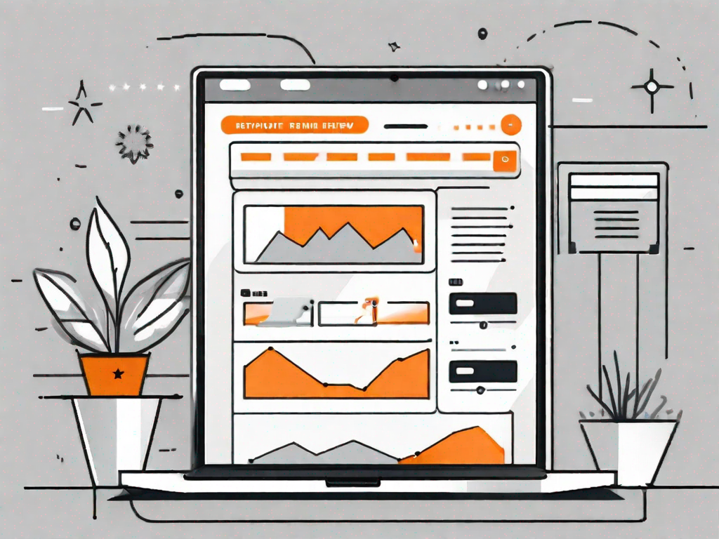
In today's digital age, having a responsive product review page is crucial for the success of any e-commerce business. With the increasing use of mobile devices, it is important to ensure that your review page looks and functions seamlessly across all devices. In this article, we will explore the importance of a responsive review page and guide you through the process of designing and implementing one using Webflow.
Understanding the Importance of a Responsive Review Page
Product reviews play a significant role in the decision-making process of online shoppers. They provide valuable insights into the quality, usability, and overall experience of a product. By offering a responsive review page, you are enhancing user experience and making it easier for potential customers to access and navigate through the reviews, regardless of the device they are using.
The Role of Product Reviews in E-commerce
Before diving into the technical aspects of designing a responsive review page, let's take a moment to appreciate the role of product reviews in the e-commerce industry. Customer reviews are not only beneficial for shoppers seeking validation but also for businesses as they build credibility, trust, and improve search engine rankings.
When a potential customer is browsing through an online store, they often rely on product reviews to gain insights into the quality and performance of a particular item. These reviews act as a virtual word-of-mouth, providing real-life experiences and opinions from previous buyers. This social proof helps shoppers make informed decisions, boosting their confidence in the product and the brand.
Moreover, product reviews also contribute to the overall credibility of an online store. When a website showcases a vast collection of positive reviews, it establishes trust among potential customers. They feel more comfortable making a purchase knowing that others have had a positive experience with the product and the company.
Additionally, search engines take into account the presence and quality of product reviews when determining the ranking of a website. Websites with a higher number of positive reviews tend to rank better in search engine results, increasing their visibility and attracting more organic traffic. This highlights the importance of having a responsive review page that allows users to easily access and engage with customer reviews.
What Makes a Review Page Responsive?
A responsive review page is designed to adapt to different screen sizes and orientations, providing an optimal user experience regardless of the device being used. It involves utilizing flexible layouts, fluid images, and media queries that allow the page to respond and adjust its content dynamically based on screen dimensions.
One of the key elements of a responsive review page is a flexible layout. This means that the page's structure and elements adjust and rearrange themselves to fit the available screen space. Whether a user is viewing the review page on a large desktop monitor or a small smartphone screen, the layout will adapt to ensure readability and usability.
In addition to a flexible layout, a responsive review page also incorporates fluid images. These images are designed to scale and resize proportionally, maintaining their quality and aspect ratio across different devices. This ensures that images within the reviews are displayed optimally, providing users with a visually appealing experience.
Furthermore, media queries are used to apply specific styles and adjustments to the review page based on the device's screen size. By utilizing media queries, the review page can target specific screen dimensions and apply custom styling to enhance readability and usability. For example, on smaller screens, the font size may be increased, and the spacing between elements may be adjusted to accommodate the limited space.
By implementing these responsive design techniques, a review page can provide an optimal user experience on any device, be it a desktop computer, laptop, tablet, or smartphone. This ensures that potential customers can easily access and navigate through the reviews, making informed decisions and ultimately increasing the likelihood of a successful purchase.
Getting Started with Webflow
Now that you understand the importance of a responsive review page, let's delve into the world of Webflow – a powerful web design tool that enables you to create stunning, responsive websites without any coding knowledge.
An Introduction to Webflow's Interface
The first step to designing your responsive review page is familiarizing yourself with Webflow's user-friendly interface. Its intuitive design makes it easy for beginners to navigate and create visually appealing websites.
Setting Up Your Webflow Account
In order to utilize Webflow's features and start designing your review page, you will need to set up an account. Simply visit the Webflow website and sign up by providing your email address and a password. Once you have successfully created an account, you're ready to dive into the world of responsive design.
Designing Your Product Review Page
Now that you have a solid foundation in Webflow, it's time to start designing your product review page. The layout and design of your review page play a crucial role in engaging customers and ensuring seamless navigation.
Choosing the Right Layout for Your Review Page
The layout you choose for your review page will largely depend on the nature of your products and the amount of information you want to showcase. Consider using a combination of grids, columns, and sections to organize your content effectively.
Utilising Webflow's Design Tools
Webflow offers an array of design tools and features that enable you to customize your review page according to your brand's aesthetics. From typography, colours, and background images to buttons, forms, and interactive elements – Webflow has everything you need to create a visually stunning and user-friendly review page.
Making Your Review Page Responsive
Once your review page is designed, it's essential to make it responsive. Responsiveness ensures that your review page looks great and functions seamlessly, regardless of the user's device or screen size.
Understanding Responsiveness in Web Design
Responsive design involves creating a layout that adapts and responds to different devices. This includes using fluid grids, flexible images, and media queries. Understanding the principles of responsive design will help you ensure that your review page looks and performs its best on any device.
Implementing Responsive Design Elements in Webflow
Webflow simplifies the process of making your review page responsive. By utilizing Webflow's built-in tools and responsive settings, you can easily adjust the layout, typography, and images to ensure a seamless user experience across devices.
Testing and Optimising Your Review Page
Designing and implementing a responsive review page is just the first step. It's equally important to thoroughly test your page's responsiveness and optimize its performance to maximize user satisfaction.
How to Test Your Page's Responsiveness
Webflow provides an easy-to-use preview feature that allows you to test your review page on different devices and screen sizes. Take the time to test your page on a range of devices to ensure it looks consistent and functions flawlessly across the board.
Tips for Optimising Your Product Review Page
Optimizing your review page involves paying attention to the loading speed, image optimization, and overall user experience. Ensure that your page loads quickly, all images are properly compressed and optimized for web, and that the navigation and functionality are intuitive and user-friendly.
By following these steps and implementing a responsive review page using Webflow, you are setting yourself up for success in the competitive world of e-commerce. A responsive review page not only enhances user experience but also helps build trust and credibility, ultimately leading to increased conversions and customer satisfaction.

Let's
Let’s discuss how we can bring reinvigorated value and purpose to your brand.
.svg)