
.svg)
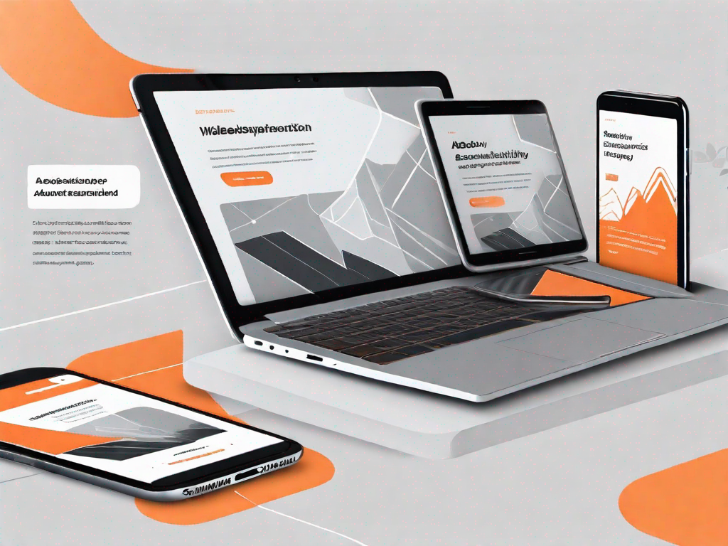
How to design a responsive about section in Webflow
.svg)
In today's digital age, a well-designed website is crucial for establishing a strong online presence. One important aspect of a website is the "About" section, which provides visitors with valuable insights into your business or brand. In this article, we will explore the process of designing a responsive about section in Webflow – a powerful web design platform that allows you to create visually stunning and user-friendly websites with ease.
Understanding the Importance of a Responsive About Section
Before diving into the technicalities, it is essential to understand why a responsive about section is so vital for your website. The about section serves as an introduction, giving visitors a glimpse into your company's story, values, and mission. It creates a connection between you and your audience, establishing trust and credibility.
Additionally, a responsive design ensures that your about section looks and functions flawlessly on all devices, whether it's a smartphone, tablet, or desktop. With an increasing number of users accessing the web through mobile devices, it is crucial to provide an optimal experience across all platforms.
When it comes to web design, every element plays a significant role in captivating your visitors' attention and engaging them with your brand. The about section, in particular, holds immense potential to leave a lasting impression on your audience. It provides a space to convey your brand's unique selling propositions, showcase your team, and share your achievements.
An effective about section tells your story in a compelling way, allowing your audience to connect with your brand on a deeper level. By sharing your company's journey, values, and mission, you can establish a sense of authenticity and build trust with your visitors. This connection is crucial in converting them into loyal customers who believe in your brand and its offerings.
The Role of an About Section in Web Design
In the realm of web design, the about section plays a crucial role in captivating your visitors' attention and converting them into loyal customers. It provides a space to convey your brand's unique selling propositions, showcase your team, and share your achievements. An effective about section tells your story in a compelling way, leaving a lasting impression on your audience.
When designing your about section, it is essential to consider the overall aesthetics and user experience. The layout, typography, and imagery should align with your brand's identity and create a visually appealing experience for your visitors. By incorporating visually engaging elements, such as high-quality images and videos, you can enhance the overall impact of your about section.
Furthermore, the about section should be strategically placed within your website's layout. Placing it in a prominent position, such as the homepage or navigation menu, ensures that visitors can easily access and engage with it. This visibility increases the chances of visitors exploring your about section and getting to know your brand better.
Benefits of a Responsive Design
Having a responsive about section offers numerous benefits for both users and businesses. Firstly, a responsive design ensures that your website adapts to different screen sizes, providing an optimal viewing experience for users. This not only enhances user satisfaction but also improves your website's usability and accessibility.
With the increasing use of mobile devices, it is crucial to prioritize mobile responsiveness. A responsive about section allows your visitors to access and engage with your brand's story seamlessly, regardless of the device they are using. This adaptability enhances the overall user experience and encourages visitors to spend more time exploring your website.
Moreover, a responsive design positively impacts your site's search engine optimization (SEO). Search engines, such as Google, prioritize mobile-friendly websites and rank them higher in search results. By creating a responsive about section, you increase your website's visibility and attract more organic traffic.
Additionally, a responsive design contributes to faster loading times, which is crucial for retaining visitors. Studies have shown that users tend to abandon websites that take too long to load. By optimizing your about section for responsiveness, you ensure that visitors can access the information they seek quickly, reducing the chances of them leaving your website.
In conclusion, a responsive about section is a vital component of a successful website. It not only establishes a connection between your brand and your audience but also enhances the overall user experience and improves your website's visibility. By investing in a responsive design for your about section, you can effectively convey your brand's story, values, and achievements, leaving a lasting impression on your visitors.
Getting Started with Webflow
Now that we understand the importance of a responsive about section, it's time to explore the exciting world of Webflow. Webflow is an innovative web design platform that empowers designers to create breathtaking websites without writing a single line of code.
An Introduction to Webflow's Interface
Webflow's user-friendly interface allows designers of all levels to bring their visions to life. From its intuitive drag-and-drop editor to its powerful design tools, Webflow provides a seamless experience for designing responsive websites. Make yourself familiar with Webflow's interface to unlock its full potential.
Key Features of Webflow for Designing About Sections
Webflow offers a range of features specifically designed to create exceptional about sections. These include customizable pre-built components, flexible layout options, dynamic animations, and interactive elements. Familiarize yourself with these features to elevate your about section's design.
Steps to Design a Responsive About Section in Webflow
Now, let's dive into the practical steps to design a responsive about section in Webflow. By following these steps, you'll be able to create an engaging and visually appealing about section that leaves a lasting impression on your visitors.
Setting Up Your About Section Layout
The first step in the design process is setting up your about section's layout. Take advantage of Webflow's grid system to create a well-structured and visually balanced layout. Experiment with different column widths and arrange your content in a way that guides your visitors' eyes smoothly.
Adding and Formatting Text in Webflow
Once your layout is in place, it's time to add and format the text for your about section. Use Webflow's text editor to customize fonts, sizes, colors, and spacing. Remember to craft informative and compelling copy that succinctly communicates your brand's story and core values.
Incorporating Responsive Images and Media
A picture is worth a thousand words, and incorporating visuals in your about section can significantly enhance its impact. Webflow allows you to seamlessly upload and optimize images for various devices. Ensure that your images resize responsively and consider using videos to engage your audience further.
Enhancing Your About Section with Advanced Webflow Features
To truly take your about section to the next level, utilize Webflow's advanced features that bring interactivity and animation to your design.
Using Webflow's Interactions and Animations
Webflow's interactions and animations enable you to create dynamic effects that captivate your visitors. Implement subtle animations, such as parallax scrolling or fading elements, to add depth and visual interest to your about section.
Implementing Responsive Design with Webflow's Grid System
Webflow's grid system allows you to create responsive designs that adapt seamlessly to different screen sizes. Leverage the grid system to ensure that your about section looks great on devices of all sizes, providing an optimal user experience.
Testing and Optimising Your About Section
Once your about section is designed, it's crucial to test and optimize it to ensure the best user experience.
Previewing and Testing Your Design on Different Devices
Webflow offers built-in preview and testing functionalities that allow you to see how your about section appears on various devices. Test your design on different screen sizes and operating systems to identify and address any issues or inconsistencies.
Tips for Optimising Your About Section for User Experience
To optimize your about section further, consider implementing user experience best practices. These include ensuring fast loading times, minimizing distractions, and providing clear navigation. Additionally, gather feedback from users to make data-driven improvements.
In conclusion, a responsive about section is a crucial element of a successful website. By utilizing the powerful tools and features Webflow provides, you can design an engaging and visually stunning about section that captivates your audience. So, why wait? Dive into Webflow and unlock your design potential today!
Related Posts


Let's
Let’s discuss how we can bring reinvigorated value and purpose to your brand.
.svg)