.svg)
How to design a responsive order confirmation page in Webflow
.svg)

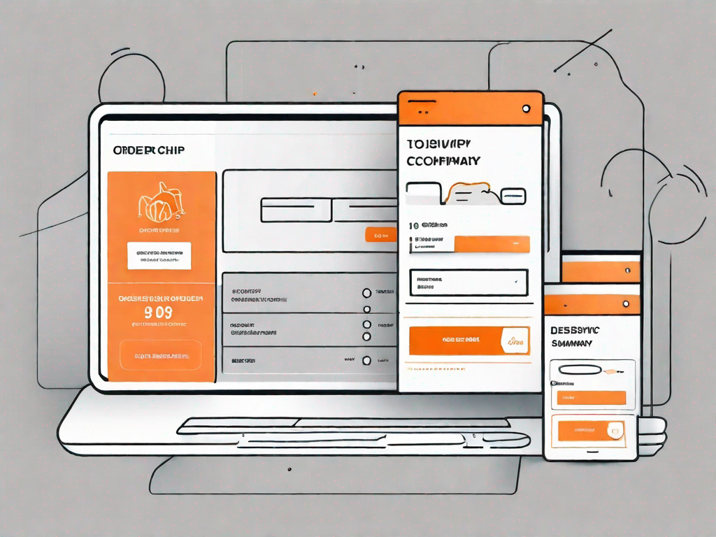
In today's digital age, designing a responsive order confirmation page has become crucial for businesses to provide a seamless user experience. A well-designed order confirmation page not only reassures customers about their purchase but also enhances their overall satisfaction with the brand. In this article, we will explore the importance of a responsive order confirmation page and guide you through the process of designing one using the powerful Webflow platform.
Understanding the Importance of a Responsive Order Confirmation Page
An order confirmation page plays a vital role in the online purchasing journey. It serves as a confirmation that the customer's order has been successfully processed and provides essential information such as order details, delivery information, and payment confirmation. This page acts as a bridge between the customer's shopping experience and the fulfillment of their order.
The Role of an Order Confirmation Page
A well-designed order confirmation page not only confirms the customer's purchase but also provides an opportunity for businesses to strengthen their relationship with the customer. By displaying relevant information and branding elements, such as logos or custom messages, businesses can reinforce their brand image and build trust and loyalty.
Imagine this scenario: You've just made a purchase from your favorite online store. You eagerly wait for the confirmation page to load, and when it finally does, you're greeted with a personalized message thanking you for your purchase. The page showcases the store's logo, creating a sense of familiarity and reassurance that you made the right choice. It also displays a summary of your order, including the items you purchased, their prices, and any applicable discounts or promotions. This attention to detail not only confirms your order but also gives you a sense of satisfaction and confidence in your decision.
Moreover, an order confirmation page can serve as a platform for upselling or cross-selling additional products or services, thereby increasing revenue potential. Imagine if, alongside your order details, you were presented with a curated selection of complementary products or exclusive offers. This strategic placement can entice you to explore more options and potentially make additional purchases, benefiting both the business and the customer.
Why Responsiveness Matters
With the increasing use of mobile devices for online shopping, it is essential to design order confirmation pages that are responsive and optimized for various screen sizes. A responsive design ensures that the page adapts seamlessly to different devices, offering an optimal viewing experience to customers regardless of the device they are using.
Consider this: You've just made a purchase using your smartphone while on the go. As you eagerly await the confirmation page, you're relieved to find that it loads quickly and fits perfectly on your device's screen. The text is clear, the images are crisp, and the buttons are easy to tap. This smooth and hassle-free experience leaves a positive impression, making you more likely to return to the store for future purchases.
By prioritizing responsiveness, businesses can maximize conversion rates and provide a positive user experience, ultimately leading to customer satisfaction and repeat business. Whether customers are shopping on their desktop computers, tablets, or smartphones, they should be able to navigate the order confirmation page effortlessly and without any frustration.
It's worth noting that a responsive order confirmation page not only benefits customers but also businesses. With a growing number of people using mobile devices for online shopping, failing to provide a seamless mobile experience can result in missed opportunities and potential loss of customers. By investing in a responsive design, businesses can stay ahead of the curve and cater to the evolving needs and preferences of their customers.
In conclusion, an order confirmation page is more than just a confirmation of a customer's purchase. It is an opportunity for businesses to leave a lasting impression, strengthen their brand image, and potentially generate additional revenue. By designing a responsive order confirmation page, businesses can ensure that customers have a positive experience across all devices, leading to increased customer satisfaction and loyalty.
Getting Started with Webflow
Webflow is a powerful web design tool that empowers designers to create stunning and responsive websites without needing to write code. Whether you are a beginner or an experienced designer, Webflow provides a user-friendly interface and a wide range of features to transform your design ideas into reality.
An Introduction to Webflow
Before diving into designing your order confirmation page, it's essential to familiarize yourself with the key features and functionalities of Webflow. Webflow offers a visual web design approach, enabling you to design and customize every aspect of your website using an intuitive drag-and-drop interface. With its built-in content management system and hosting capabilities, Webflow provides a comprehensive solution for designing, building, and launching your website.
Key Features of Webflow for Designing Pages
Webflow offers a plethora of features that make designing webpages a breeze. From flexible layout options to pre-designed components and animations, Webflow provides a robust toolkit to bring your design vision to life. You can leverage its responsive design capabilities to ensure that your order confirmation page looks great on any screen size. Additionally, Webflow allows for easy integration with third-party tools, such as analytics or email marketing services, to further enhance the functionality of your order confirmation page.
Designing Your Order Confirmation Page
When designing your order confirmation page, it is crucial to create a visually appealing and user-friendly layout that effectively communicates the necessary information to the customer. Let's explore the key steps to take when designing your order confirmation page using Webflow.
Setting Up Your Page Layout
The first step is to define the layout of your order confirmation page. Consider organizing the page in a logical and hierarchical manner, ensuring that the most important information, such as order details and delivery information, is easily accessible. Utilize Webflow's responsive grid system to create a dynamic layout that adapts to different screen sizes, providing an optimized experience for users on various devices.
Choosing the Right Design Elements
Design elements such as typography, color schemes, and imagery play a significant role in creating a visually appealing order confirmation page. Choose fonts and colors that align with your brand's identity and create a cohesive visual language throughout the page. It is also important to use high-quality imagery that accurately represents the product or service the customer has purchased.
Implementing Responsiveness in Your Design
With Webflow's responsive design capabilities, you can easily ensure that your order confirmation page is optimized for a variety of devices. Test how your page looks on different screen sizes and make necessary adjustments to ensure that all information is displayed correctly and intuitively. Use Webflow's breakpoints and flexible design options to create a seamless user experience across desktop, tablet, and mobile devices.
Testing Your Order Confirmation Page
Once you have designed your order confirmation page, it is essential to thoroughly test its responsiveness across multiple devices and screen sizes. Testing allows you to identify and address any usability or display issues, ensuring that every customer has a consistent and enjoyable experience.
Importance of Testing for Responsiveness
Testing your order confirmation page for responsiveness is crucial as it helps you identify any issues that may arise when users access your page on different devices. By testing, you can ensure that all elements are displayed correctly, the page is easy to navigate, and the overall experience is seamless. Identifying and resolving any issues early on can enhance user satisfaction and minimize potential barriers to completing the purchase process.
Tools for Testing Your Page's Responsiveness
Webflow provides built-in tools to preview and test your order confirmation page across different devices directly within the platform. Additionally, you can use external tools such as browser developer tools or online responsive design testers to simulate various screen sizes and assess the page's responsiveness. By utilizing these tools, you can fine-tune your design and ensure a consistent experience for all users.
Optimising Your Order Confirmation Page
Now that you have a well-designed and responsive order confirmation page, it's time to optimize it further to enhance the user experience and drive customer satisfaction.
Enhancing User Experience
Consider adding personalized touches to your order confirmation page to make customers feel valued and appreciated. This could include displaying a personalized thank-you message, offering relevant resources or support information, or providing easy access to customer service channels. By going the extra mile in terms of user experience, you can leave a lasting impression on customers and foster a positive perception of your brand.
Tips for Improving Page Responsiveness
To further improve the responsiveness of your order confirmation page, consider implementing some best practices. Optimize images and media files to ensure faster loading times, minimize the use of unnecessary animations that can cause performance issues, and optimize code to reduce page size. By prioritizing page speed and performance, you can create a seamless and enjoyable user experience.
In conclusion, a well-designed and responsive order confirmation page is crucial for businesses to provide a positive user experience and enhance customer satisfaction. By following the steps outlined in this article and leveraging the power of Webflow, you can create visually stunning and highly functional order confirmation pages that leave a lasting impression on your customers. Remember to test your designs across multiple devices and continuously optimize your page to stay ahead in today's competitive online landscape.
Related Posts
Let's
Let’s discuss how we can bring reinvigorated value and purpose to your brand.


.svg)