
.svg)
How to design a responsive grid gallery in Webflow
.svg)
Webflow is a powerful web design tool that allows you to create stunning websites with ease. One of its notable features is the ability to design a responsive grid gallery. In this guide, we will walk you through the process of designing a grid gallery in Webflow, and how to make it fully responsive across different devices.
Understanding the Basics of Webflow
Before we dive into designing a grid gallery, let's take a moment to understand what Webflow is and its key features.
Webflow is a visual web design tool that enables you to create websites without writing code. It combines the flexibility of a professional web design tool with the ease of a visual builder, allowing you to design and build responsive websites quickly and efficiently.
But what sets Webflow apart from other web design tools? Let's explore some of its key features.
What is Webflow?
Webflow offers a range of features that make it an excellent choice for designing websites. Some of its key features include:
- Drag-and-drop functionality: With Webflow, you can easily drag and drop elements onto your canvas, making it simple to create and arrange the layout of your website.
- Visual design interface: The visual design interface in Webflow allows you to see your changes in real-time, making it easy to experiment and iterate on your designs.
- Responsive design capabilities: Webflow provides powerful tools for creating responsive designs. You can easily adjust the layout and styling of your website to ensure it looks great on different screen sizes.
- Ability to add custom animations and interactions: With Webflow's built-in animation and interaction tools, you can bring your designs to life. Add subtle animations or create complex interactions to engage your users.
- Full control over HTML, CSS, and JavaScript: Unlike some other visual web design tools, Webflow gives you complete control over the underlying code of your website. This means you can customize every aspect of your design, from the structure to the styling and functionality.
Importance of Responsive Design in Webflow
Responsive design is crucial in today's mobile-first world. With a growing number of users accessing websites on mobile devices, it's essential to ensure that your designs are optimized for different screen sizes.
Webflow makes it easy to create responsive designs that look great on any device. Whether your users are browsing on a smartphone, tablet, or desktop computer, your website will adapt and provide an optimal viewing experience.
By using Webflow's responsive design capabilities, you can ensure that your website is accessible to a wide range of users, regardless of the device they are using.
So, now that we have a better understanding of what Webflow is and its key features, let's move on to designing a grid gallery using this powerful web design tool.
Setting Up Your Webflow Account
Before you start designing your grid gallery, you'll need to set up a Webflow account and create a new project.
Webflow is a powerful web design tool that allows you to create stunning websites without the need for coding. Whether you're a seasoned designer or just starting out, Webflow provides an intuitive interface that makes the design process a breeze.
Creating a new project in Webflow is quick and easy. Let's walk through the steps together.
Creating a New Project
To create a new project in Webflow, simply sign in to your account and click on the "New Project" button. This button is conveniently located in the dashboard, making it easy to find.
Once you click on the "New Project" button, you'll be prompted to give your project a name. It's important to choose a name that reflects the purpose of your website, as it will help you stay organized as you work on multiple projects.
After naming your project, you'll have the option to choose various settings, such as layout width and typography options. These settings allow you to customize your project according to your specific needs and preferences.
Webflow offers a wide range of layout options, including fixed, fluid, and responsive layouts. Depending on the nature of your website, you can choose the layout that best suits your design goals.
In addition to layout options, Webflow also provides a variety of typography settings. You can choose from a selection of fonts, adjust font sizes, and fine-tune other typographic elements to create a visually appealing and cohesive design.
Once you've customized your project settings, simply click on the "Create Project" button, and voila! Your new project is ready for you to start designing.
Navigating the Webflow Interface
Once you've created your project, you'll be taken to the Webflow interface. The interface is thoughtfully designed to provide you with all the tools and features you need to bring your design ideas to life.
The Webflow interface is divided into different sections, each serving a specific purpose. Let's explore these sections to help you navigate through the platform with ease.
The Designer section is where the magic happens. This is where you'll build your website, create layouts, and design every element to perfection. The Designer provides a visual canvas where you can drag and drop elements, adjust properties, and see your design come to life in real-time.
Webflow's Designer is powered by a flexible and intuitive grid system that allows you to create responsive designs effortlessly. You can easily define breakpoints, set up different layouts for various devices, and ensure that your website looks great on desktop, tablet, and mobile.
Another important section of the Webflow interface is the CMS (Content Management System). The CMS allows you to manage your website's content, making it easy to update and publish new content without the need for coding. With the CMS, you can create collections, add dynamic content, and organize your website's data in a structured and efficient manner.
Webflow also provides a powerful interactions and animations editor, which allows you to add motion and interactivity to your designs. With this editor, you can create engaging animations, transitions, and scroll effects that enhance the user experience and make your website stand out.
Lastly, the Webflow interface includes a powerful style manager that helps you maintain consistency throughout your design. The style manager allows you to define global styles, create reusable classes, and easily update design elements across your entire website.
By familiarizing yourself with the Webflow interface, you'll be able to make the most of its features and unleash your creativity without any limitations.
Now that you're all set up with your Webflow account and project, it's time to dive into designing your grid gallery. Let your imagination run wild and create a visually stunning website that will captivate your audience.
Introduction to Grid Gallery in Webflow
Now that you have a grasp of the basics, let's explore what a grid gallery is and why it's a valuable addition to your website.
What is a Grid Gallery?
A grid gallery is a layout that allows you to display multiple images in a visually appealing grid format. It's an excellent way to showcase a portfolio, a collection of products, or any other visual content on your website.
Benefits of Using a Grid Gallery
Using a grid gallery in your website design offers several benefits:
- Organized display: With a grid layout, you can neatly arrange multiple images, ensuring a clean and visually pleasing presentation.
- Efficient use of space: Grid galleries make the most of limited space, allowing you to showcase more images without overwhelming the viewer.
- User-friendly navigation: Grid galleries often come with intuitive navigation features, such as hover effects or lightbox views, making it easy for users to explore the images.
Designing Your Grid Gallery
Now that you understand the concept and benefits of a grid gallery, it's time to dive into the design process.
Choosing the Right Layout
The first step in designing your grid gallery is selecting the right layout. Webflow offers a range of grid options, such as masonry or fixed grid, each with its own unique look and feel. Consider the nature of your content and the overall style of your website to make an informed choice.
Adding and Organising Images
Once you've chosen a layout, it's time to add and organize your images. Webflow allows you to easily upload images and organize them within your grid gallery. Consider the order, size, and balance of your images to create an engaging visual experience for your users.
Customising the Appearance of Your Grid
To make your grid gallery truly yours, take advantage of Webflow's customization options. You can adjust spacing, apply various hover effects, add captions, and even incorporate animations to truly bring your gallery to life. Experiment with different settings to find the perfect aesthetic for your website.
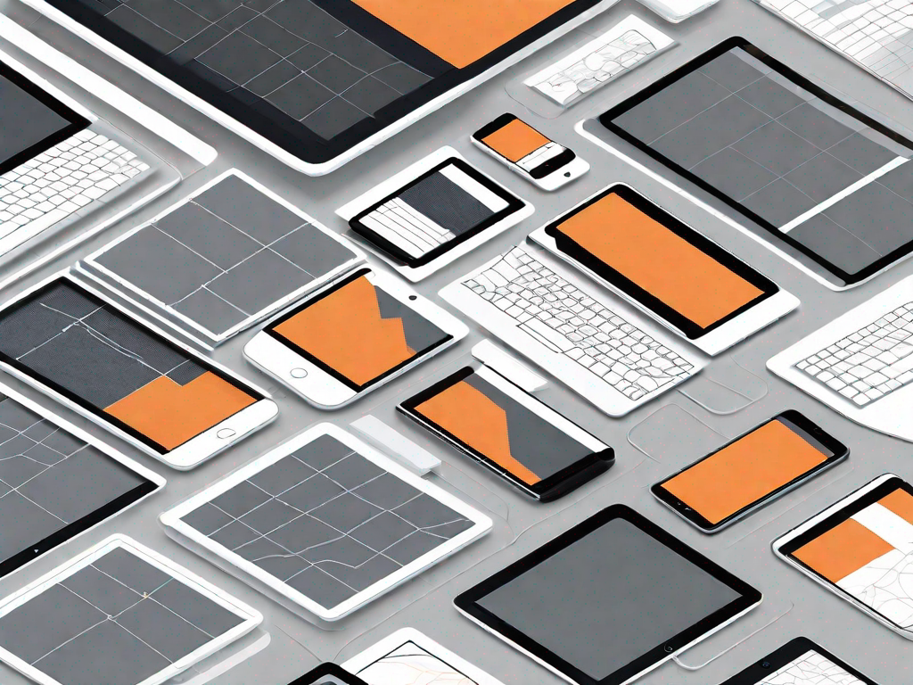
Making Your Grid Gallery Responsive
One of the crucial aspects of designing a grid gallery in Webflow is ensuring its responsiveness across different devices.
Understanding Responsiveness in Webflow
Webflow's responsive design capabilities allow you to create layouts and styles that adapt seamlessly to different screen sizes. Understanding how responsiveness works in Webflow is essential to ensure your grid gallery looks great on desktops, tablets, and mobile devices.
Adjusting Your Grid for Different Devices
Webflow makes it easy to adjust the appearance of your grid gallery for different devices. You can use breakpoints and device-specific styling to optimize the layout, image sizes, and other elements specifically for each device type. Test your grid gallery on various devices to ensure a consistent and visually appealing experience.
Testing Your Grid Gallery's Responsiveness
Once you've made the necessary adjustments, it's important to test your grid gallery's responsiveness thoroughly. Check how it looks on different devices, ensuring that images rearrange and resize dynamically, providing an optimal viewing experience for all users.
With these steps, you are well on your way to designing a responsive grid gallery in Webflow. Take your time, experiment with different options, and remember to test and optimize your gallery for different devices. The end result will be a visually stunning and user-friendly grid gallery that showcases your content with style.


Let's
Let’s discuss how we can bring reinvigorated value and purpose to your brand.
.svg)