
.svg)
How to design a responsive gallery section in Webflow
.svg)
Web design has become increasingly important in today's digital age. With more and more people accessing websites through different devices, it is crucial to create responsive designs that adapt to various screen sizes. In this article, we will explore how to design a responsive gallery section in Webflow, a powerful web design tool that allows you to create professional and visually stunning websites without any coding knowledge. Whether you are a novice or an experienced web designer, this guide will provide you with the necessary steps to create a captivating and adaptive gallery section.
Understanding the Basics of Webflow
Before diving into the specifics of designing a responsive gallery section, let's first familiarize ourselves with the basics of Webflow. So, what exactly is Webflow? In simple terms, Webflow is a visual web design tool that empowers designers to create websites using a drag-and-drop interface. It combines the ease of use of website builders with the flexibility of coding, allowing you to have full control over your design without writing a single line of code.
Webflow has gained popularity among designers and developers for its intuitive interface and powerful features. With Webflow, you can create stunning websites that are not only visually appealing but also highly functional. Whether you're a beginner or an experienced designer, Webflow provides a user-friendly platform that caters to your needs.
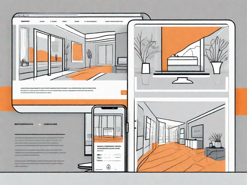
One of the key features of Webflow is its responsive design framework. In today's digital landscape, it's essential for websites to be accessible and visually appealing across different devices and screen sizes. With Webflow's responsive design capabilities, you can easily create websites that adapt seamlessly to various devices, ensuring a consistent user experience.
In addition to its responsive design framework, Webflow also offers a powerful content management system (CMS). This feature allows you to manage and update your website's content effortlessly. Whether you need to add new pages, edit existing content, or create blog posts, Webflow's CMS provides a user-friendly interface that simplifies the content management process.
Furthermore, Webflow provides a robust e-commerce platform that enables you to create and manage online stores. Whether you're selling physical products, digital downloads, or services, Webflow's e-commerce functionality allows you to set up a professional and secure online store without the need for complex coding or third-party integrations.
Now that we have a basic understanding of Webflow and its key features, let's move on to the importance of responsiveness in web design. Responsive web design is the practice of creating websites that adapt and respond to different screen sizes and devices. With the increasing use of smartphones and tablets, it's crucial for websites to provide an optimal browsing experience across all devices.
A responsive website not only ensures that your content is accessible to a wider audience but also improves user engagement and conversion rates. When users can easily navigate and interact with your website on any device, they are more likely to stay longer, explore your content, and take the desired actions, such as making a purchase or submitting a contact form.
Moreover, responsive design is also a factor that search engines consider when ranking websites. Search engines like Google prioritize mobile-friendly websites in their search results, as they aim to provide the best user experience to their users. Therefore, having a responsive website can positively impact your search engine visibility and organic traffic.
In conclusion, Webflow is a powerful web design tool that combines the ease of use of website builders with the flexibility of coding. Its responsive design framework, CMS, and e-commerce platform make it a popular choice among designers and developers. Understanding the importance of responsiveness in web design is crucial for creating websites that provide a seamless user experience across different devices. So, let's delve deeper into designing a responsive gallery section using Webflow.
Importance of Responsiveness in Web Design
In the age of smartphones and tablets, it is no longer enough to design websites solely for desktop screens. With the vast array of devices used to access the internet, it is essential to create designs that respond and adapt to different screen sizes. This is where responsive design comes into play.
Responsive design ensures that your website looks and functions optimally across all devices, providing an exceptional user experience. It eliminates the need for separate versions of your website for different devices, saving you time and effort. Moreover, responsive design is not just about aesthetics; it is a vital factor in search engine optimization (SEO) as search engines prioritize mobile-friendly websites.
Starting Your Gallery Section Design
Now that we have covered the basics, let's get started on designing your gallery section. The first step is to set up your Webflow account if you haven't already done so. Head over to the Webflow website and sign up for a free or paid account.
Once you have your account set up, familiarize yourself with the Webflow interface. Spend some time exploring the various tools and features available to you. This will give you a better understanding of how Webflow works and help you navigate through the design process smoothly.
When you are ready, create a new project in Webflow. Select a template or start from scratch, depending on your preference and the requirements of your gallery section.
Building Your Gallery Section
Now that you have set up your project, it's time to start building your gallery section. The first decision you need to make is choosing the right layout for your gallery. Consider the number of images you want to showcase and the overall visual aesthetic you want to achieve. Webflow offers various layout options, such as grid, masonry, and carousel, each with its own unique characteristics.
Once you have selected a layout, it's time to add and organize the images in your gallery. With Webflow's intuitive interface, you can easily upload images and arrange them to your liking. Consider grouping similar images together or creating categories to enhance the browsing experience.
To make your gallery truly stand out, take advantage of Webflow's customization options. Experiment with different fonts, colors, and styles to create a visually appealing gallery that aligns with your overall website design. Remember to keep the user experience in mind, ensuring that it is intuitive and easy to navigate.
Making Your Gallery Responsive
Now comes the most crucial part: making your gallery responsive. Understanding responsiveness is key to creating a gallery that looks great on all devices. Responsive design involves designing your website in a way that its layout and content adapt to different screen sizes seamlessly.
In Webflow, you can adjust the layout of your gallery for different devices by utilizing breakpoints. Breakpoints allow you to define how your design should appear at specific screen sizes. By rearranging elements and adjusting widths and heights, you can ensure that your gallery maintains its visual appeal across devices.
Before finalizing your responsive gallery, it is essential to test it thoroughly. Preview your website on various devices and screen sizes to ensure that your gallery looks and functions as intended. Make any necessary adjustments to guarantee an optimal user experience across all devices.
Conclusion
In conclusion, designing a responsive gallery section in Webflow is an achievable task for both beginners and experienced web designers. By understanding the basics of Webflow, recognizing the importance of responsiveness in web design, and following the steps outlined in this guide, you can create a stunning and adaptive gallery that captivates your audience.
Remember, responsiveness should be at the forefront of your design process, ensuring that your website looks great and functions flawlessly across all devices. With the power of Webflow, you have the necessary tools to bring your creative vision to life. So, go ahead and embark on your gallery design journey with confidence!


Let's
Let’s discuss how we can bring reinvigorated value and purpose to your brand.
.svg)